Thursday, June 07, 2007

painted trees?


One odd thing (maybe just odd to me, I guess) while driving through Scottsdale, was that I saw a bunch of trees throughout all the neighborhoods that were painted white from the bottom up. It actually looks kinda neat, but I'm assuming there's a more practical reason for it? Perhaps to prevent some sort of damage from bugs or disease or something? Can anyone clue me in?

Ice Breakers "Center" gum

I like this funny green guy illustration. Gum's not bad either.

Wednesday, June 06, 2007

Hotel Valley Ho

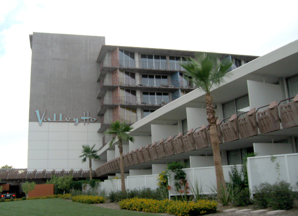
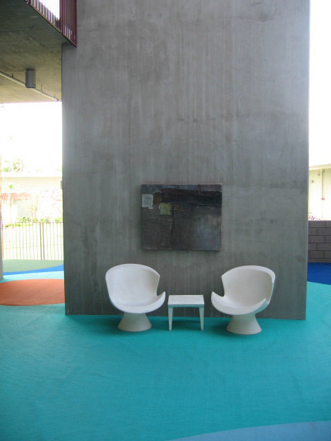
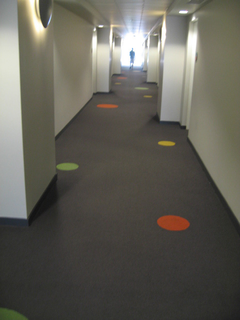
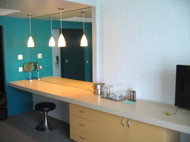
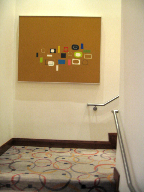
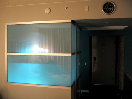
So, as I mentioned earlier, I spent this past weekend in Scottsdale, AZ. I stayed at the fabulous Hotel Valley Ho, and had a great time. The hotel really did a stellar job of blending retro styling with a modern aesthetic. Everything was new, but they kept a lot of the integrity of the original, by keeping much of the original color scheme and preserving a lot of the architectural details, such as the cast concrete tiling that is throughout the hotel. The journey to the room was fun as you passed through an additional outdoor seating area. It acted as a great meeting/waiting place if you had other friends staying at the hotel. The hallways were carpeted with fun accent circles. What I loved best was the thought they put into the room. I already mentioned the bathroom, but the other nice feature was the long extended table that acted as vanity and desk. It's so nice to come into a room and have a big area to plop your stuff down on. I'll be posting some more of the fun things I saw in Scottsdale, but here's a link to my flickr page of more shots of the hotel.

Tuesday, June 05, 2007

Mark Luthringer

I am so thrilled to have come across the work of photographer Mark Luthringer, via the Dwell blog. He is having an exhibit right now in San Francisco at 3A Architecture entitled "Ridgemont Typologies." The images, or rather series of images, he is showing in this collection, I personally find both compelling and somewhat comforting at the same time. A little digging at his website and I found more amazing images- I also really love his "40 monuments to progress" series and "Latent" book. Also worth noting is he includes an artist statement on each group, definitely worth checking out!
Image from MarthLuthringer.com

Monday, June 04, 2007

blue munday: mood lighting

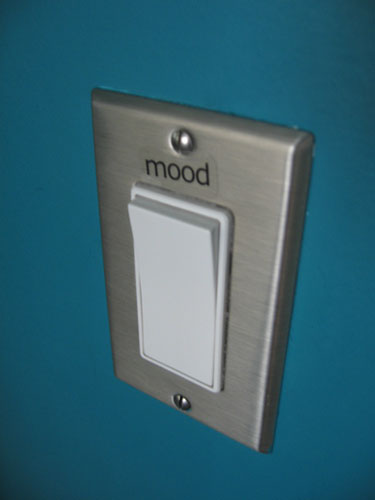
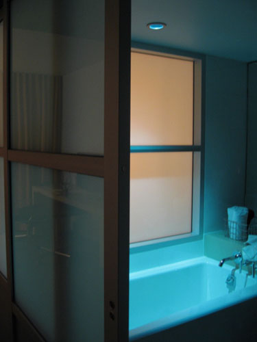
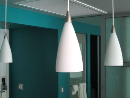
I'm still in Arizona, and will be travelling monday back home. While here, I've seen lots of great things, and am impressed at how much modern there is in this desert town. Originally, I was debating on staying at the new Mondrian, or the more retro Hotel Valley Ho. I opted for the Valley Ho, and really glad I did. The place is a lot of fun and they did such a great job of mixing old and new. One of my favorite things is the bathroom. I've posted about mood lighting before, and when I opened up the bathroom door at the Hotel Valley Ho, there was this curious label above the light switch. There was the word "MOOD". I flipped the switch and was pleasantly surprised that there was a cool blue light above the tub!They also used a really great turquoise/teal color on on the accent wall .
It was really visually refreshing and such great color inspiration for the summer...

Friday, June 01, 2007

56 new spot colors!

oooh... pretty... Pantone has just released 56 new spot colors. As a design geek, this excites me. Check out the fun animation at their website.

The white zone is for loading and unloading

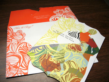
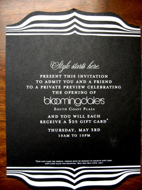
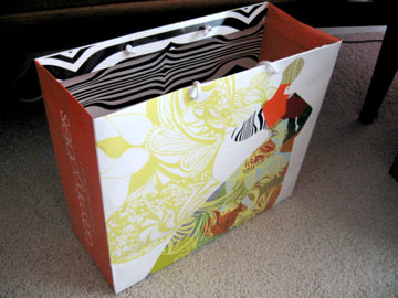
I'm going to be travelling a bit today, so my posting will be a little weird- however, I should be interweb-connect-able, so hopefully I can post a bit over the weekend. Heading off to Scottsdale/Phoenix, so thank you to those that emailed and left suggestions- will definitely keep you posted! In the meantime, Bloomingdales recently opened a brand spankin' new fabulous store here in OC, at South Coast Plaza. The space is quite impressive, and for the grand opening, they sent out these really nice invitations. I really liked the graphics on them, and they co-ordinate with the shopping bags too (uh... not that I bought anything already... um.... yeah...). I love the crazy overlapping semi-clashing patterns and the silhouette. Great colors too. Did anyone else get one of these? I'm wondering if it's just their standard grand-opening graphic or if it was special to South Coast Plaza.

Thursday, May 31, 2007

Sprinkles cupcakes

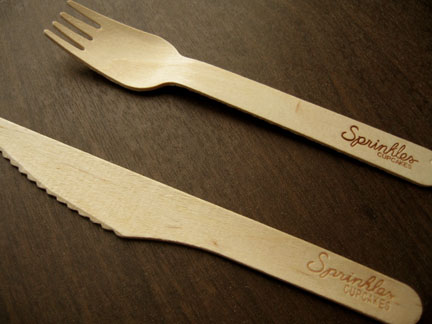
Oh the joy of yummy yummy cupcakes. They recently opened a Sprinkles cupcakes here in OC. Those who know me well, know I'm a slave to the cupcake. These Sprinkles cupcakes are quite nice- (although quite $$spendy). The ones pictured are (clockwise from top left, dark chocolate, mocha, cinnamon sugar, and dark chocolate banana. I love that they color coded them. They do have great packaging and design, as recently noted by Monocle magazine. Check out this link where they interview the architect/designer that helped create the visual identity. I also love these wooden spoon and forks they give away there. I'd like to collect a bunch and use them for other things... picnic anyone?

hamster powered paper shredder

Ok, there's a certain amount of genius-ness going on here... (via Core77)

Wednesday, May 30, 2007

Method Recap/Follow up

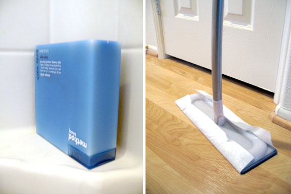
So now that I've had some time to spend with these recent Method products, here is my personal review. First up is the Omop. When I first saw these, I was immediately sucked in by the packaging. When I got it home, it put together fairly easily. I was a little concerned that the curved handle would prove to be difficult to store, but in the end, it isn't really a problem at all. I love the microfiber cleaning pad. It really seems to work well with my floor. However, I'm not the biggest fan of their sweeping pads. Being a graphics guy, I like that they used the logo as the debossed ridges, but I feel like they aren't deep enough. My old swiffer pads seem to pick up more because they have deeper ridges. But on the flip side, I do love the fact that the Omop pads are corn-based and degradable. I am not yet on a verdict as to whether or not I like the size of the cleaning head. Its a bit larger than my swiffer, but I'm not sure if that's a bad thing or a good thing. Overall, I'm pretty pleased with it, but still wish the sweeping pads were a little more thicker/deeper.

Next up is the Method Bloq skin care line. I received a nice sample pack and was able to test out each fragrance and product style. Overall, I really like them. The scents are all lovely, and my favorites right now are the green mint and beach sage scents. I love the creamy textures. I only have two gripes. The shaving lotion is kinda weak. It doesn't seem to give enough lubrication when I shave. The second gripe is the hard plastic packaging makes it a little difficult to squeeze the product out- however, I found that if I store the product upside down, then problem solved. Gravity is your friend. The square design of it makes it easy to flip over, so perhaps it was designed that way... (or not?) Anyway- if any of you guys have these products, what is your review?

Tuesday, May 29, 2007

talk bubble paper clips


I find these talk bubble paperclips really funny... (and potentially really useful!) available here.

Monday, May 28, 2007

blue munday: what's above Yves Béhar?

I hope everyone, who's in the States, had a great Memorial Day weekend. Technically, it's still monday, so I'm sneaking in a little Blue Monday post. I found this image of designer Yves Béhar, in one of the press disks from ICFF. It was in association with this new line of dog products that these students created, under the guidance of Mr. Béhar. Read more about it on my post for AT:LA. But what I found so striking about this picture is what's above Mr. Béhar's head. I love all the random blue lights that are suspended from the ceiling. I also love that they are all painted blue! It totally reminds me of a display you'd see at Barney's Co-Op- how they paint all the props that same blue color. (I'm dying to try that somewhere in my house!) I think it works really well in this particular space because it becomes the focal color (notice that everything else is white) and it's such an unexpected place for it too. Plus it stays functional because it's all lighting. I could see this as a fun idea to do if you have a studio/work place, or even for a modern outdoor patio or something. Actually, it could be a fun idea for a dining room too. If you kept the table/chairs and main pieces white- and added a pop color using multiple lights from the ceiling, all painted in the same hue.
Over the weekend, I saw another example of random lights all unified by color at South Coast Plaza. This is actually located above the stairwell, that is by the conceirge desk, by the Williams Sonoma store on the top floor. I don't know how long it's been there, but I just noticed it. Anyway, it might not work in all situations, but it's a fun idea if you have the space.

Friday, May 25, 2007

TGIF and Arizona?

I feel like this week was some sort of crazy alternate universe- with the whirlwind rush to NYC to cover ICFF, and then coming back to find a pushed up deadline for a big project at work- my mind has been crazed. Anyway- its FINALLY friday and a long weekend too! (its a holiday on monday in the states) (hooray!) I have so many things to post up and report about so I'll be doing that over the weekend- check back if you get a chance!

Another thing, I wanted to know if there were any Arizona Happy Mundane-rs? I'm going to be in Phoenix/Scottsdale next weekend and wanted to know if any of you could give me any recommendations? It's my first time there and I'm really excited! Let me know any tips, food places, shops, thrift stores, sights, etc... that I should check out in the comments- Would be greatly appreciated!

Thursday, May 24, 2007

Blue Thursday: Fishys!

Since I missed monday's Blue Munday this week, I'm adding it in for thursday. Look at these cool fishys! They're ceramic fish wall hangings as featured in the latest HOME magazine. They remind me of those vintage enameled metal dishes that were popular awhile back. Unfortunately the mag lists these as made by Global Views, which looks to be the manufacturer, but not the end retailer. Has anyone seen these online or in a store?

Tuesday, May 22, 2007

So much to say, so little time

Hello friends- I just got back from NY to cover ICFF for Apartmenttherapy LA. But when I got back, found out my deadline for a major project got pushed up and so suddenly I'm in that post trip catch-up scramble. Check out ATLA or any of the AT sites (Chicago, SF, and NY)for updates on the fun things at ICFF this year. I will post more later tonight/tomorrow. In the meantime, here's a shot taken by my ATLA co-conspirator editor, Gregory, of the incredibly cute new kids stuff from Amenity Home- I love the and 70's retro vibe!! deer, bunnies, and turtles! c'mon- you got love the turtles...

Friday, May 18, 2007

WYWO2.3 the next steps

So, color-scheme in check, the next step for the parental family room makeover was what to get rid of and what to get. Unfortunately, after a little reality check, I couldn't get rid of much. Well, at least what I wanted to get rid of, hehe. I had to keep the couch. I had to keep the TV. To make things more frustrating, I couldn't move the couch much nor could I move the TV. The cable box to the TV is actually right in that corner, and I couldn't move it without having all these exposed wires. The couch is so huge, placing it in any other direction would either not fit, or block the view of the TV, which I had to make sure you could still see it from the eating area and kitchen. What I could get rid of was the weird corner shelf, I could move the piano, and I could get rid of the existing coffee table and light. As much as I wanted to "re-design" the space, the actual layout ended up having to stay the same. But at least I could add a little color, and make it more cozy.

Time was of essence. I only had one weekend to pull this off because they were coming home on the following friday, and I knew I wouldn't have time with the busy work week. I conned asked a friend to help and we were off. First stop was Home Depot to get paint. I chose a darker purple-grey ish for the wall behind the couch. Then off to IKEA, cuz I knew they'd have the most affordable pieces (since I was paying for this as sort of a mother's day gift). I found this great rug that would definitely ground the space:It was the perfect size and brought in the colors of the living room. I also got some lower sized BILLY cabinets , a new coffee table with more storage, and a larger corner tv stand. That blew quite a good chunk of my budget (I comitted to not spending more than $1000- so Trading Spaces of me huh?) but I still a little for accessories. By the way, I discovered quite quickly that there is a reason why there are proffessional piano movers. That piano was ... HELL to move. Note to self. Don't do that again.

What I also needed was something over the fireplace. I felt like I needed some sort of sculpture or something dimensional. What I really wanted was some sort of C.Jeré type of thing. But I couldn't find anything locally. So, I got all crafty and made something. It turned out like this:Sorry for the long post, I'll have more details in the next one and the final result. To be continued...

Thursday, May 17, 2007

Olive oil dishes by Mary Judge

I'm posting this on AT:LA today, but wanted to share it here too. I just love the simple graphic beauty of these olive oil dishes by Mary Judge. The gradation effect is achieved due to the concentric rings, and what depth the oil is at. They were inspired by the terraced olive groves in Italy. My friend Em bought one last holiday while we were visiting A+R, and I secretly am kicking myself for not getting one then. However, you can still get one now, right here ($18) at Lekker Home.

Wednesday, May 16, 2007

Aldo Londi + Ceramics by Bitossi

The Interior Design magazine's March 07 (sorry, i'm kinda slow) 75 anniversary edition, featured a spread on the ceramics of Aldo Londi for Ceramiche Bitossi, produced by Flavia. Last year the cdompany reissued a bunch of Londi vases from 1950-1970, relying on the original techniques and documents wheever possible. They are a-m-a-z-i-n-g. I am obsessing over the orange cat. Check out all the other reissues / or "re-editions" in their catalog section at the Flavia website.

Tuesday, May 15, 2007

WYWO 2.2: Needing a buffer.

The first major issue that I had to tackle for the parental's family room makeover was color. You have this retro 70's orange/black/tan vibe vs. the purple/pink/dark browns look that sort of flows in from the living room. So whattyagonna do? I've always found that when you're trying to make contrasting colors blend, the answer is what I call, buffer colors. This basically means colors that you add in to form a new colorstory and help transition all the colors together.When I try to decorate any room, it usually helps me to start with one object/thing/inspiration that ties together all the colors. Granted, this isn't always needed, but it always helps me. It can be found in anything... a piece of artwork, or a fabric... a tchotchke... anything... After looking around, I actually realized I already had found the answer. A pillow I had purchased awhile back for them from Pier 1. The shimmery silky fabric had all the colors from the living room, but also some new colors, like some greens and the orange I was trying to figure out how to incorporate. The key color it turned out was that green. I needed to inject some olive-y yellow-y greens to act as my buffer color. So... now that I had a color game plan, I could move on to the next step... figuring out what to get rid of and what I needed to get... (to be continued)...

Monday, May 14, 2007

Blue Munday: indigo sea prints

Happy munday. This is a crazy week for me. I'm under a huge deadline for work, and I'm leaving out of town this friday for a super quick trip. Here's a little calming visual eye candy. These "Indigo Sea prints" from West Elm. Looks like they used that "sun print" paper to create these. I love that sunprint paper. So much fun. I actually used them for a promotional piece a few years ago, going with the theme of "exposure". Get your own sunprint paper here, or get these framed beauties here (and they're on sale!).