Tuesday, February 06, 2007

lace-y chain link

Oh the chain link fence. Such an icon of the urban/suburban life. You pass by so much everyday, but how lovely would it be if you had to walk by some like this?Designed by Demakersvan, a dutch team, this cool lace fence is going into production in India, according to a great post I just read over at dezeen. The lace fence was a big hit in last year's Milan show. I love how you can turn something like strong steel wire, and still make it delicate and beautiful. I love the contrast. I also love how brilliant it is that they saw past the function of a chain link fence, and saw the potential beauty of the visual pattern that is actually similar to lace. It's also so nice to see some of these great concept pieces you read about in design mags/blogs actually become reality. I wish they'd put some up here in Irvine though... read more here and here.

Monday, February 05, 2007

portable paper towels and car batteries

Saw this in the February 2007 Real Simple "products of the month" (I posted a summary of the issue on ATLA today) I'm not sure exactly when would be the best time to use one of these... but that doesn't stop me from still desperately wanting a pack. I guess it could be great for your car, or if you're on a camping/hiking trip, out and about. Kinda coolness though don'tcha think?

And speaking of things for your car, the other thing I really want is this portable car "battery booster" they also featured. You can recharge your battery from the inside of the car (note: this is not a "jump starter") which could prove to be quite useful if you're stranded somewhere... Does anyone have one of these? Would love to hear your thoughts...

And it's all true...

Sad. Weekend is over. Back to the grind. However, there can be beauty in the monotony. Tracey Thorn, of EverythingButTheGirl fame, has a solo album coming out that I am eagerly anticipating. Her new single is great. 80's esque- but fresh and classic. And it also has a new very happy mundane video to match. Have a good day. It's almost lunch time. or dinner. or... tuesday...?

Friday, February 02, 2007

random metal pieces as art

I spotted this in the Pottery Barn catalog- ok my friends- I need your help - what do you call these things (the metal disc things that have the starburst hole patterns)? metal vents/grating/steamer/thing with holes bit...ugh...???? I'm totally drawing a blank as to what they're called- but I love that they painted them white and mixed them with oblong platters and plates. You could probably take the concept even less traditional and mix in other objects whose shape and form you like and still unite them through a single color. Have any of you put something unexpected on your walls like this? (I'm still trying to figure out what those pieces are called!.. argh!!..)

George Dombek

I really love these incredible watercolor paintings by George Dombek. The buckets and cans one is my favorite, but I also really love the one with the upside down kettles. They remind me of people heads or muppets for some reason. He has other beautiful works on his site.
They're so realistic, it's hard to believe they're watercolor!

Thursday, February 01, 2007

Bird branch on a table

I thought this was a really nice DIY idea for a table, featured in the latest Rachael Ray Magazine. They asked designer Angela Adams for a table centerpiece idea, and she painted a branch and put little birds on it. I like how everything is pretty white, making the branch really striking and then they just added simple red accents to coordinate. You could probably glue on other things besides birds too.. buttons, silk flowers, butterflies... lego action figures? (I'd probably paint mine blue though.. hehe)

Wednesday, January 31, 2007

Top Design...

I'm so excited to watch design heroes, Jonathan Adler and Kelly Wearstler on Top Design tonight! (hopefully I can stay up!) It will be nice to see Todd Oldham on TV again too. There's some preview clips floating around YouTube, if you haven't already seen them- here and here- So far from the clips, the one thing that already annoys me is that theme song! but the rest of it looks interesting- It will be neat to see where they shoot as well, since it was filmed in LA. Speaking of Jonathan Adler, have you seen the interviews with Tim Gunn on the Bravo site? There's 6 of them and they are hillarious! But there was a phrase that Jonathan said that I found quite brilliant- he said "...start with a classical foundation, and end it with playful punctuation." That is so true, and I think are words to live by for any type of design challenge you may face. You can get more info and insights at the great BloggingTopDesign blog. So who's going to watch Top Design tonight?

a dozen egg vases


These totally "crack" me up... (har har har...)

Tuesday, January 30, 2007

Corporate logo redos

Last night, a common plight for most so cali folk and all who live in suburbia, I had to refuel my gas tank. I was running on fumes, so I stopped at the closest station that happened to be a Chevron. I suddenly noticed that their logo changed. I'm sure this is probably old news, but it hadn't struck me until now. It's weird. They added these gradients and I guess it makes it look like ribbons or something. My question is... um... why? What was wrong with the old one? To me, the old Chevron logo is a classic one. Iconic, simplistic, and highly memorable. I could understand slightly modifying the typeface, but the logo itself now seems kind of...muddy? with the new gradients. Granted, its 2007. Capabilities have come a long way, and with everything going digital, reproducing these gradients probably isn't a big deal. Clients are constantly coming to art directors and graphic designers to "redo" their image. Often times, a logo/brand mark is the first step. But I've always been of the school that changing an already established logo isn't necessarily always.. necessary. Sometimes it is, sometimes it isn't. In this case, I happen to think this logo change wasn't. But that's just my mundane observation. After a little digging, I found several blogs have been discussing this. here and here are two. What do you guys think?

Anyways... this weekend, I also noticed another company has recently changed their logo, El Pollo Loco. (love their twice grilled burrito by the way) This redesign I'm not really bothered by, although personally the "El" seems kinda after-thought-ish. Anyways, I guess much like your home or your wardrobe, a little change and refreshing can be needed, and big multi million/billion corporations are apparently not exempt.

Monday, January 29, 2007

Garfield

walmart update 1.2007

So, some interesting things at Walmart.com for Spring 2007. They've got some pieces in the Black and White scheme that still feels strong in decorland:

I like this "Trees" tabletop set (online only, 4 place setting and includes a runner)...or this "Moonlight Tranquility" 16 piece dinnerset
They have apparently channeled their inner classic Jonathan Adler and offer this ceramic table lamp (nice that they kept the shade brown) (UPDATE: I just looked on the site again and it's kinda funny, at least they're admitting it, as the description reads " Recalling the work of today's most sought-after ceramicists...",) and 3 piece vase set (which is on sale! $27 for the whole set of three! I may need these...)And finally, this "Lauryn" Sateen bedding set could be an affordable option if you're looking for something a little more glamourous.

I haven't had a chance to stop by in person and see if any of these are in-store, but I'll report back if/when I do...

Sunday, January 28, 2007

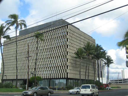
mundane aesthetic: oahu 1.07

Saturday, January 27, 2007

Yikes! I've been tagged?!

Yikes! There's a tagging outbreak over the blogsphere and now Scrappygirl has tagged me! Last August, Mary Jo at Trust Your Style tagged me to reveal random info about myself. But if anyone is still curious, here are 5 more things you may not already know about me:

1. I don't know how to drive stick shift.

2. I don't like coconut.

3. I don't like raw ginger- but I love gingerbread, and like ginger tea (but it has to have honey.)

4. I like creating a special concoction of ketchup and soy sauce to dip my gyoza or chinese dumplings in.

5. The last pet I had was a goldfish that lived for several years after killing all of its potential friends I tried to bring to it. I guess it wanted to be alone. I currently don't have any pets, but am currently considering a dog or a cat.

Ok, so now to spread the tagging, (hehe) I am going to tag my fellow ATLA editors, Richele, Gregory, and Vanessa. Each have their own personal blogs with lots of fun things to read and look.

I'm also going to tag my It's(k)notwood co-editor Em, who has just recently started her own visually inspiring personal blog, SuperCozy!

Friday, January 26, 2007

Weekend stuff

Happy FRIDAY!!! It's a busy day today but I'm so glad its friday. Have to run to another meeting- but here are a few things I saw today that you might be interested in. Over at Apartmenttherapy LA(sorry, just have to plug), a few of us LA editors decided that since so many readers open up their homes to us, we'd share some of our artwork collections with our readers. Click here to check out some of my favorite art pieces in my house, as well as my fellow editors Richele, and Gregory- who have some fantastic pieces. Also- yesterday, there was this amazing amazing feature on ATNY about artist Mary Temple. Also my always in-the-know friends at Shelterrific busted the news that my all time favorite MUJI is opening in NY! All I can say is. OMG.OMG. OMG.
I'll be posting over the weekend as well, so check back when you get a sec and enjoy the rest of your day!

Thursday, January 25, 2007

Jing fly swatter

Saw this on Stylehive today, isn't this the most beautiful fly swatter?

Wednesday, January 24, 2007

Martin + Osa

Have you heard of Martin + Osa? It's American Eagle's latest concept brand. More high-end, and geared toward an older customer than AE. They only have a few stores, and recently opened a one here in Fashion Island, Newport Beach. Interesting concept... sort of take a little Nike + J.Crew + Patagonia... and mix it all up. It's very active outdoor-ish-travel and explore the world while kayaking or hiking sort of vibe, but still looking fashionable... the women's clothing looks more interesting than the mens, but the quality seems nice. Pricepoint a bit high, but not tooo obnoxious. Their marketing collateral and overall image looks fantastic and spot on. I really love the logo and packaging. Anyways, I bought a candle there. They stuck it in this neat tyvek pouch, as opposed to wrapping it, and then sent me on my way with this little bag. What I loved even more was another unexpected suprise: inside the bag had this printed card that just said "adventure." Even though I'm not really their target customer (I'd rather eat cupcakes and go to sleep) I again, appreciate these details. As far as "adventure", today I will dream of fantasy escapes... while I take my nap... (at least I have a very active imagination...hehe)

Tuesday, January 23, 2007

Blue Tuesday: mason jars

Whenever I go on a plane, that's generally the only time I get to read In-Style magazine. (by the way, did you know Instyle has a home design blog? by Martha McCully, who was a judge in the DesignStar show on HGTV). In the February issue, they had a section about different areas to set up an office, and I was immediately attracted to these vintage blue mason jars (apparently from Paula Rubenstein for $55-70 each?). I know many people use jars to hold things, but the blue ones looked so fresh and happy. Now I am on a mission to find some on my next thrift store/estate sale excursion... aren't they nice though?

Monday, January 22, 2007

Jones Organics cap

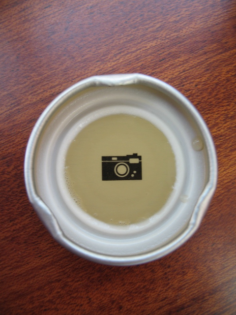
Have you tried Jones Organic Teas? Jones, the company that is famous for those soda bottles that have people's photos, now makes organic teas. I had the peach flavored one. It was yummy. But what I found really intersting was underneath the cap. I know there are several companies that put little sayings and things underneath their caps, and I really appreciate the subtle little suprise. Underneath the Jones Organics one I had, was a neat little camera icon. I don't know if each one has something different, but I really liked this little camera icon. Does anyone know if they all have that? or is there something different on other ones?

Sunday, January 21, 2007

Olle Eksell: swedish graphic designer

Recently purchased this amazing book of Olle Eksell, a swedish graphic designer. I picked it up at the Giant Robot store in Silverlake. I just love all the illustrations, but its from PIE books (who always put out great design books) so it's all in Japanese. However, the pictures speak for themselves. Aside from his numerous illustrations for advertising and whatnot- he also designed some beautiful textiles, and continues to do so today. I made another short flip-through video so you can see how packed the little book is. The ISBN number is : ISBN-89444-547. It's also available here.

Friday, January 19, 2007

Sophie Ellis Bextor: Catch You

This video is all over the blogsphere, and I have to agree with them that there's something really striking about it. Aside from being a Sophie Ellis Bextor fan (I am a pop culture junkie if you haven't figured that out) I love the simplicity, and how powerful the color red can be. And actually I wouldn't mind running around Venice right about now (minus the red dress, thankyouverymuch.) Happy friday- I'll have some additional posts over the weekend-