 How awesome are these bookcovers (perhaps to conceal that scandously trashy novel you're reading... you know who you are, hehe)- by Kate Spade?! download them for free here (click on "downloads) What are you reading this summer?
 How awesome are these bookcovers (perhaps to conceal that scandously trashy novel you're reading... you know who you are, hehe)- by Kate Spade?! download them for free here (click on "downloads) What are you reading this summer?


 I have a love/hate thing with actress Chloe Sevigny. But love her or hate her, you gotta love these limited edition posters. They were designed by Work in Progress, and are part of Self Service magazine's issue that pays tribute to her. They are available at Colette's eshop. My favorite is are the two shots with the blue type. So graphic and bold!
 Tim Biskup is one of my favorite illustrators. Recently, I stopped by his gallery, located inside the Johnson Motor's store in Old Town Pasadena, and came across his fantastic book called "American Cyclops". This thin, but oversized hardback book showcases some of the work that was in an exhibition he did in Spain. The inside cover is printed in fluorescent orange ink- so cool.
  He's a local So California artist- and I love his blend of Disney / retro /punk /sci-fi /skateboarding style. You can get a copy of your own at via the GiantRobot store. ($39.95)


 Last night, a common plight for most so cali folk and all who live in suburbia, I had to refuel my gas tank. I was running on fumes, so I stopped at the closest station that happened to be a Chevron. I suddenly noticed that their logo changed. I'm sure this is probably old news, but it hadn't struck me until now. It's weird. They added these gradients and I guess it makes it look like ribbons or something. My question is... um... why? What was wrong with the old one? To me, the old Chevron logo is a classic one. Iconic, simplistic, and highly memorable. I could understand slightly modifying the typeface, but the logo itself now seems kind of...muddy? with the new gradients. Granted, its 2007. Capabilities have come a long way, and with everything going digital, reproducing these gradients probably isn't a big deal. Clients are constantly coming to art directors and graphic designers to "redo" their image. Often times, a logo/brand mark is the first step. But I've always been of the school that changing an already established logo isn't necessarily always.. necessary. Sometimes it is, sometimes it isn't. In this case, I happen to think this logo change wasn't. But that's just my mundane observation. After a little digging, I found several blogs have been discussing this. here and here are two. What do you guys think?
 (love their twice grilled burrito by the way) This redesign I'm not really bothered by, although personally the "El" seems kinda after-thought-ish. Anyways, I guess much like your home or your wardrobe, a little change and refreshing can be needed, and big multi million/billion corporations are apparently not exempt.
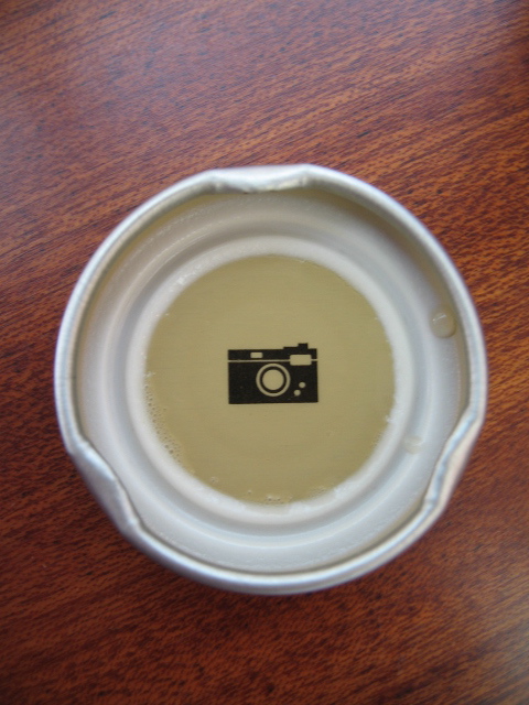 Have you tried Jones Organic Teas? Jones, the company that is famous for those soda bottles that have people's photos, now makes organic teas. I had the peach flavored one. It was yummy. But what I found really intersting was underneath the cap. I know there are several companies that put little sayings and things underneath their caps, and I really appreciate the subtle little suprise. Underneath the Jones Organics one I had, was a neat little camera icon. I don't know if each one has something different, but I really liked this little camera icon. Does anyone know if they all have that? or is there something different on other ones?
 Recently purchased this amazing book of Olle Eksell, a swedish graphic designer.
  I picked it up at the Giant Robot store in Silverlake. I just love all the illustrations, but its from PIE books (who always put out great design books) so it's all in Japanese. However, the pictures speak for themselves.
 Aside from his numerous illustrations for advertising and whatnot- he also designed some beautiful textiles, and continues to do so today.
 I made another short flip-through video so you can see how packed the little book is. The ISBN number is : ISBN-89444-547. It's also available here.

 Posts
All Comments
Posts
All Comments


