 I've posted about lace fencing, but here's another fence from Tejo Remy that takes the fence and adds an additional function- seating! (via Inhabitat)
 I've posted about lace fencing, but here's another fence from Tejo Remy that takes the fence and adds an additional function- seating! (via Inhabitat)


 I've always been one of those people that likes to put stuff on their refrigerator. Lots of magnets and fun things. I love moodboards and bulletin boards and love having things that inspire me around. However, I can see that it doesn't always make the "neatest" impression, and in a small space, the more you can hide visual clutter, the larger it looks. My kitchen is pretty small, and as mentioned, I had my tchotchke's and random clippings on the fridge. Recently, I had the honor of having part of my kitchen photographed (more on that later) and during the photoshoot, I was really bothered by seeing all that "stuff" on the fridge. So I removed it, but then never put them back up. I really enjoyed the cleaner appearance, but still struggled as to where I would put up my little happy notes and stuff. Well, that has all changed now that I saw this idea in the July 2007 Living Etc. I absolutely love this idea of utilizing the INSIDE of your cupboards to tack up things. Every time you open up the cupboard, you'll get a nice visual surprise and when you're done, it goes out of sight! I'm totally going to do this. I'm just wondering if I should maybe put a thin layer of cork, or just tape it like they have in the picture (I'm thinking I'm going to opt for the simple "just tape it" solution.) Has anyone else done this? Does anyone like to keep stuff on the fridge? or nothing at all?
 Hello! Nothing like a big jolt of bright bold color to awaken your senses. Behold the July 2007 cover of House&Garden magazine. As much as I love color, (and obviously blue) I'm not sure I could have my whole house this vivid. I'm also not so sure about the photo real artwork above the couch- but otherwise, the colors do make me happy. And apparently, it also makes the homeowners happy- and that's all that really matters right?
  I do also enjoy the little details that designers William Diamond and Anthony Baratta used throughout the house, such as the alligator pillow and the argyle carpet.
 Also love the fabric selections spread that the magazine showed right after that story.
 What do you think?

 I love these witty "box" seats designed by Pieter Jamart for Sixinch. They look like "fragile" cardboard boxes, but they're obviously not. I'm not sure what they're really made out of, but clever nonetheless...
 I totally want this. It borders on being one of those "why didn't I think of that?!" things... Could be a fun father's day gift? (via Redhotshop@Target)
 Happy friday folks!!- So more on my Scottsdale adventure... first, let me say that in addition to the cupcake addiction I have, the other thing that has me utterly powerless is ice cream. So, of course, what do I pass by while walking along the streets of downtown/oldtown Scottsdale? The Sugar Bowl.
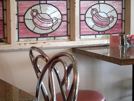 The Sugar Bowl is total old skool classic soda fountain/ice cream parlor. Family Circus comic illustrator Bill Keane counts it as a local favorite and even has included it in several of his comics.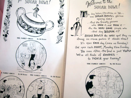
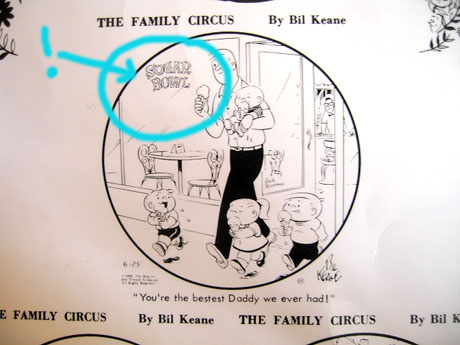 The decor looks like it hasn't really been touched and I completely fell in love with the charm. The menu and napkins are fantastic.
  I ordered the "Gosh-Awful-gooey banana split".
 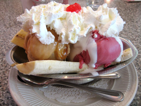 YUMMMMEEEEEEE...... enjoy your weekend!

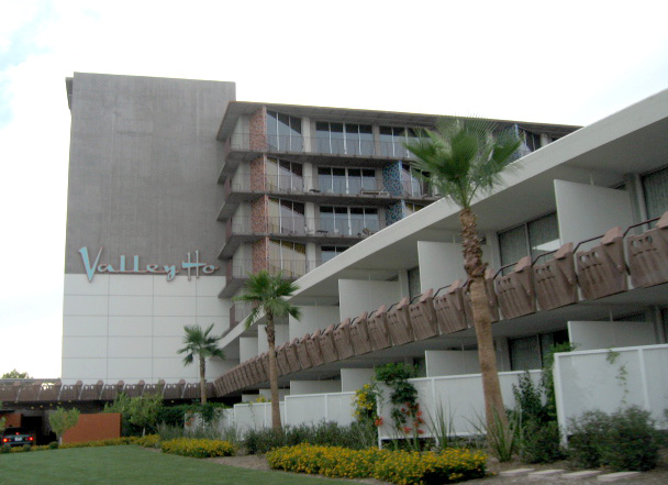 So, as I mentioned earlier, I spent this past weekend in Scottsdale, AZ. I stayed at the fabulous Hotel Valley Ho, and had a great time. The hotel really did a stellar job of blending retro styling with a modern aesthetic. Everything was new, but they kept a lot of the integrity of the original, by keeping much of the original color scheme and preserving a lot of the architectural details, such as the cast concrete tiling that is throughout the hotel.
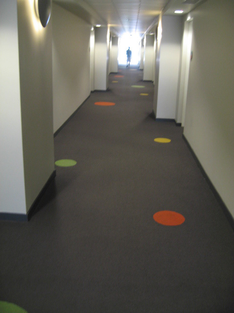
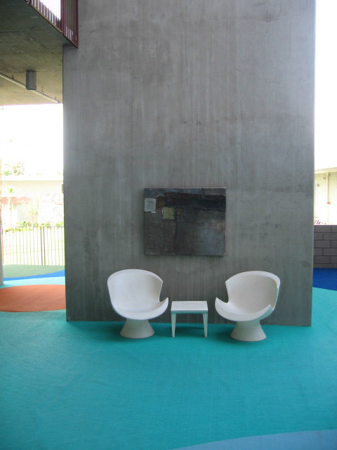 The journey to the room was fun as you passed through an additional outdoor seating area. It acted as a great meeting/waiting place if you had other friends staying at the hotel. The hallways were carpeted with fun accent circles.
  What I loved best was the thought they put into the room. I already mentioned the bathroom, but the other nice feature was the long extended table that acted as vanity and desk. I
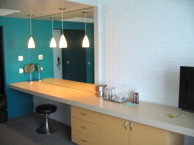 t's so nice to come into a room and have a big area to plop your stuff down on. I'll be posting some more of the fun things I saw in Scottsdale, but here's a link to my flickr page of more shots of the hotel.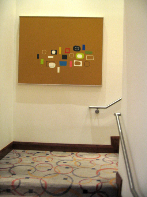
 I am so thrilled to have come across the work of photographer Mark Luthringer, via the Dwell blog. He is having an exhibit right now in San Francisco at 3A Architecture entitled "Ridgemont Typologies." The images, or rather series of images, he is showing in this collection, I personally find both compelling and somewhat comforting at the same time. A little digging at his website and I found more amazing images- I also really love his "40 monuments to progress" series and "Latent" book. Also worth noting is he includes an artist statement on each group, definitely worth checking out!
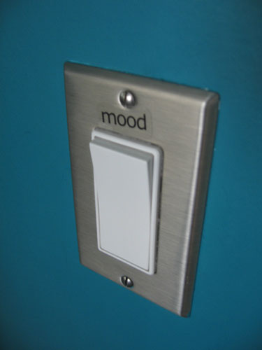 I'm still in Arizona, and will be travelling monday back home. While here, I've seen lots of great things, and am impressed at how much modern there is in this desert town. Originally, I was debating on staying at the new Mondrian, or the more retro Hotel Valley Ho. I opted for the Valley Ho, and really glad I did. The place is a lot of fun and they did such a great job of mixing old and new. One of my favorite things is the bathroom. I've posted about mood lighting before, and when I opened up the bathroom door at the Hotel Valley Ho, there was this curious label above the light switch. There was the word "MOOD". I flipped the switch and was pleasantly surprised that there was a cool blue light above the tub!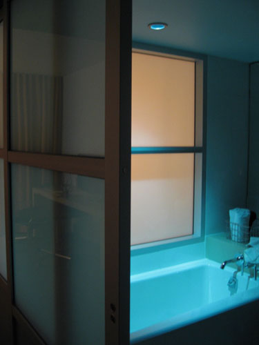
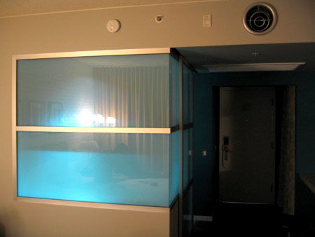 They also used a really great turquoise/teal color on on the accent wall .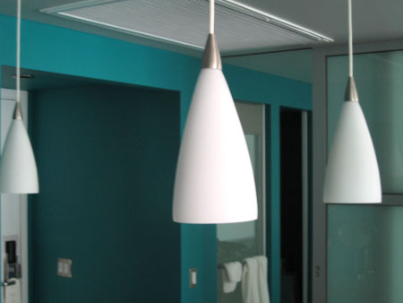
 oooh... pretty... Pantone has just released 56 new spot colors. As a design geek, this excites me. Check out the fun animation at their website.

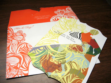
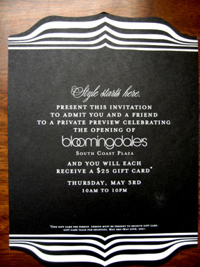
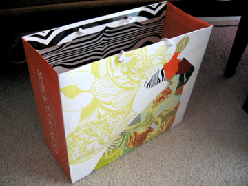
 Oh the joy of yummy yummy cupcakes. They recently opened a Sprinkles cupcakes here in OC. Those who know me well, know I'm a slave to the cupcake. These Sprinkles cupcakes are quite nice- (although quite $$spendy). The ones pictured are (clockwise from top left, dark chocolate, mocha, cinnamon sugar, and dark chocolate banana. I love that they color coded them. They do have great packaging and design, as recently noted by Monocle magazine. Check out this link where they interview the architect/designer that helped create the visual identity. I also love these wooden spoon and forks they give away there.
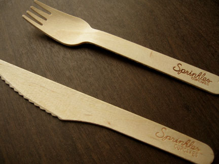 I'd like to collect a bunch and use them for other things... picnic anyone?
 Ok, there's a certain amount of genius-ness going on here... (via Core77)
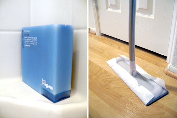 So now that I've had some time to spend with these recent Method products, here is my personal review. First up is the Omop. When I first saw these, I was immediately sucked in by the packaging. When I got it home, it put together fairly easily. I was a little concerned that the curved handle would prove to be difficult to store, but in the end, it isn't really a problem at all. I love the microfiber cleaning pad. It really seems to work well with my floor. However, I'm not the biggest fan of their sweeping pads. Being a graphics guy, I like that they used the logo as the debossed ridges, but I feel like they aren't deep enough. My old swiffer pads seem to pick up more because they have deeper ridges. But on the flip side, I do love the fact that the Omop pads are corn-based and degradable. I am not yet on a verdict as to whether or not I like the size of the cleaning head. Its a bit larger than my swiffer, but I'm not sure if that's a bad thing or a good thing. Overall, I'm pretty pleased with it, but still wish the sweeping pads were a little more thicker/deeper.

 Read more about it on my post for AT:LA. But what I found so striking about this picture is what's above Mr. Béhar's head. I love all the random blue lights that are suspended from the ceiling.
  I also love that they are all painted blue! It totally reminds me of a display you'd see at Barney's Co-Op- how they paint all the props that same blue color. (I'm dying to try that somewhere in my house!) I think it works really well in this particular space because it becomes the focal color (notice that everything else is white) and it's such an unexpected place for it too. Plus it stays functional because it's all lighting. I could see this as a fun idea to do if you have a studio/work place, or even for a modern outdoor patio or something. Actually, it could be a fun idea for a dining room too. If you kept the table/chairs and main pieces white- and added a pop color using multiple lights from the ceiling, all painted in the same hue.
 Over the weekend, I saw another example of random lights all unified by color at South Coast Plaza. This is actually located above the stairwell, that is by the conceirge desk, by the Williams Sonoma store on the top floor. I don't know how long it's been there, but I just noticed it. Anyway, it might not work in all situations, but it's a fun idea if you have the space.
 Another thing, I wanted to know if there were any Arizona Happy Mundane-rs? I'm going to be in Phoenix/Scottsdale next weekend and wanted to know if any of you could give me any recommendations? It's my first time there and I'm really excited! Let me know any tips, food places, shops, thrift stores, sights, etc... that I should check out in the comments- Would be greatly appreciated!
 Since I missed monday's Blue Munday this week, I'm adding it in for thursday. Look at these cool fishys! They're ceramic fish wall hangings as featured in the latest HOME magazine. They remind me of those vintage enameled metal dishes that were popular awhile back. Unfortunately the mag lists these as made by Global Views, which looks to be the manufacturer, but not the end retailer. Has anyone seen these online or in a store?


 It was the perfect size and brought in the colors of the living room. I also got some lower sized BILLY cabinets , a new coffee table with more storage, and a larger corner tv stand. That blew quite a good chunk of my budget (I comitted to not spending more than $1000- so Trading Spaces of me huh?) but I still a little for accessories. By the way, I discovered quite quickly that there is a reason why there are proffessional piano movers. That piano was ... HELL to move. Note to self. Don't do that again.
 Sorry for the long post, I'll have more details in the next one and the final result. To be continued...
 I'm posting this on AT:LA today, but wanted to share it here too. I just love the simple graphic beauty of these olive oil dishes by Mary Judge. The gradation effect is achieved due to the concentric rings, and what depth the oil is at. They were inspired by the terraced olive groves in Italy. My friend Em bought one last holiday while we were visiting A+R, and I secretly am kicking myself for not getting one then. However, you can still get one now, right here ($18) at Lekker Home.

 Posts
All Comments
Posts
All Comments


