It's a gorgeous sunny Saturday today here in OC. Speaking of sunny, I love this fantastic piece of yellow objects by Michael Cooper, which I found via DearAda's blog- which also has other really great finds and eye candy to check out!


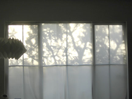 by 8:00am , it's pretty bright...
 by 10:00am, the sun starts to move a little...
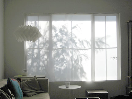 AT:NY recently posted these beautiful curtains, but I think I still prefer mine...

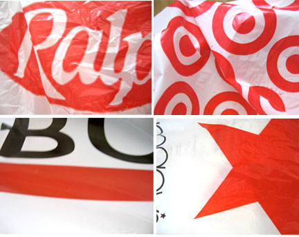 I did find a few other random things with red though...
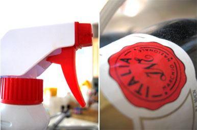 Do you have a lot of red in your home? Anyways, hope you have a happy Vday with someone you love.
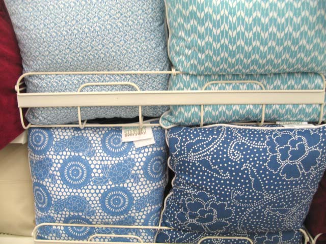 Since I missed Blue Monday, it's Blue tuesday (again).... I swung by Kmart last night, and saw this little collection of blue-themed pillows. Kinda vintage-y, but modern and graphic at the same time. Lately, Kmart has been putting out really fun dishtowels, and they continue to do so. I love the retro looks of the fruit and color blocks- and the one with the flowers would be great for easter time...
 Also spotted were these very Jonathan Adler-esque bathroom accessories from the Martha Collection. I think these could work great individually, but as a set, they seem a little hokey. They also had matching raised dot towels too...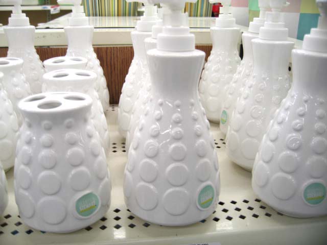
 Over the weekend I spotted an article about the new Trina Turk store in NYC that opened last December. Trina Turk, known for her laid back and lovely "California-chic" style, has two amazing stores here in So Cal, both of which were designed by Kelly Wearstler, so I found it very interesting that she chose Jonathan Adler to do the NY store. I wonder if there is any weirdness between Kelly and Jonathan, since I do see some similarities between the two, but at the same time, there are a ton of differences.
 I'm sure they're BFF since they're both on Top Design now. Regardless, the NY store looks amazing with lots of fun and color. Apparently, Trina gave Jonathan the direction of "hipster, 1970's, kind of crafty..." and I think they totally achieved that and more. It's a great extension of what he did for the Parker. The only thing that is a little funny is how much JA product he put in there, but then, I guess, it wouldn't be JA without his own stuff. I love it all. I found these pics of the store on JA's website. There is a rumour that she is considering opening a store here in Orange County! That would be fun! If there are any HappyMundane NYC'ers, I'd love to hear your first-hand review of the store if you've been there! I can't wait to check it out in person myself...


+YT_LIght+year+1_06.JPG) Mocoloco featured this amazing artist last week, and I'm still in awe of it. These delicate trees are cut out of toiletpaper rolls!! Yuken Teruya also cuts trees out of paper bags, varying from high end designers to McDonalds takeout bags. See more pieces here, here, and here.
Mocoloco featured this amazing artist last week, and I'm still in awe of it. These delicate trees are cut out of toiletpaper rolls!! Yuken Teruya also cuts trees out of paper bags, varying from high end designers to McDonalds takeout bags. See more pieces here, here, and here.
 I love the cover of the Jan/Feb 2007 ID magazine (the design one, not the British one). The collage featured is by ID Magazine's art director, Kobi Benezri. I love all the random elements laid out together- Especially the orange floppy disk. I can't remember the last time I used one of those...wow... sign of the times... Would make a great DIY art piece...
 So as I mentioned yesterday, I went to Palm Springs last weekend. I met up with Em, who co-edits It's(K)notWood, and also has just started her own blog, supercozy. She has posted some great pics of the hotel she stayed at, The Parker Palm Springs, which I'm sure most of you know, was designed by HM hero Jonathan Adler. It was her first time there, and if any of you haven't been yet, it's definitely worth a look-see, for drinks... or just general cavorting... cuz... a little weekend cavorting is always a good thing.
 A little more than I would normally pay, but it was so cool I couldn't pass it up.
 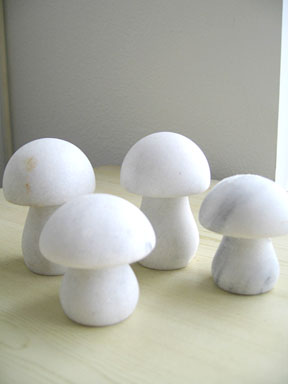 The mushrooms are made of carved marble. And the owl is paper maché from Mexico. C'mon- you just can't pass up a paper maché owl now can you? and in blue? sold!!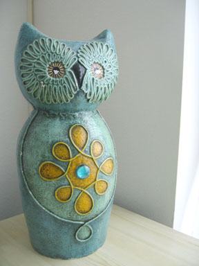
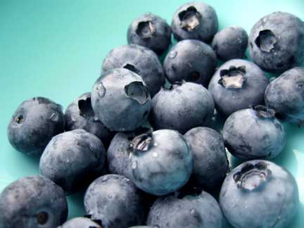 I love berries... (these were from Henry's Market- they are so plump!)
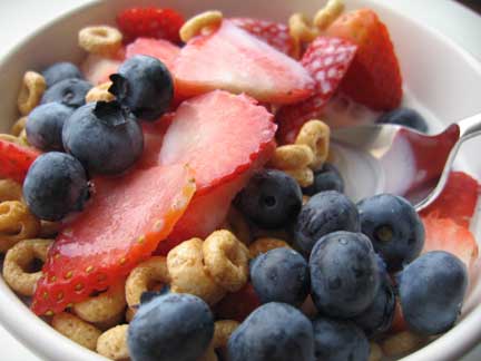 Simple pleasures indeed. One thing I always end up doing though, is mixing my cereals. In many ways, I find the mixed up concoction better than just the original mix I had bought. Once my cereal supply gets low, I end up adding in a new one and I usually find myself buying a different kind (I guess I get cereal-bored easily). I then mix the two (or three) all up and end up with this.
 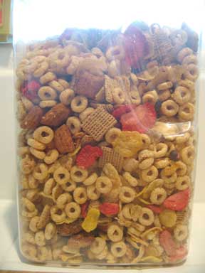 Do any of you do this?

 Designed by Demakersvan, a dutch team, this cool lace fence is going into production in India, according to a great post I just read over at dezeen. The lace fence was a big hit in last year's Milan show. I love how you can turn something like strong steel wire, and still make it delicate and beautiful. I love the contrast. I also love how brilliant it is that they saw past the function of a chain link fence, and saw the potential beauty of the visual pattern that is actually similar to lace. It's also so nice to see some of these great concept pieces you read about in design mags/blogs actually become reality. I wish they'd put some up here in Irvine though... read more here and here.
 Saw this in the February 2007 Real Simple "products of the month" (I posted a summary of the issue on ATLA today) I'm not sure exactly when would be the best time to use one of these... but that doesn't stop me from still desperately wanting a pack. I guess it could be great for your car, or if you're on a camping/hiking trip, out and about. Kinda coolness though don'tcha think?
 I spotted this in the Pottery Barn catalog- ok my friends- I need your help - what do you call these things (the metal disc things that have the starburst hole patterns)? metal vents/grating/steamer/thing with holes bit...ugh...???? I'm totally drawing a blank as to what they're called- but I love that they painted them white and mixed them with oblong platters and plates. You could probably take the concept even less traditional and mix in other objects whose shape and form you like and still unite them through a single color. Have any of you put something unexpected on your walls like this? (I'm still trying to figure out what those pieces are called!.. argh!!..)
 I really love these incredible watercolor paintings by George Dombek. The buckets and cans one is my favorite, but I also really love the one with the upside down kettles. They remind me of people heads or muppets for some reason. He has other beautiful works on his site.

 I thought this was a really nice DIY idea for a table, featured in the latest Rachael Ray Magazine. They asked designer Angela Adams for a table centerpiece idea, and she painted a branch and put little birds on it. I like how everything is pretty white, making the branch really striking and then they just added simple red accents to coordinate. You could probably glue on other things besides birds too.. buttons, silk flowers, butterflies... lego action figures? (I'd probably paint mine blue though.. hehe)
 I'm so excited to watch design heroes, Jonathan Adler and Kelly Wearstler on Top Design tonight! (hopefully I can stay up!) It will be nice to see Todd Oldham on TV again too. There's some preview clips floating around YouTube, if you haven't already seen them- here and here- So far from the clips, the one thing that already annoys me is that theme song! but the rest of it looks interesting- It will be neat to see where they shoot as well, since it was filmed in LA. Speaking of Jonathan Adler, have you seen the interviews with Tim Gunn on the Bravo site? There's 6 of them and they are hillarious! But there was a phrase that Jonathan said that I found quite brilliant- he said "...start with a classical foundation, and end it with playful punctuation." That is so true, and I think are words to live by for any type of design challenge you may face. You can get more info and insights at the great BloggingTopDesign blog. So who's going to watch Top Design tonight?
 Last night, a common plight for most so cali folk and all who live in suburbia, I had to refuel my gas tank. I was running on fumes, so I stopped at the closest station that happened to be a Chevron. I suddenly noticed that their logo changed. I'm sure this is probably old news, but it hadn't struck me until now. It's weird. They added these gradients and I guess it makes it look like ribbons or something. My question is... um... why? What was wrong with the old one? To me, the old Chevron logo is a classic one. Iconic, simplistic, and highly memorable. I could understand slightly modifying the typeface, but the logo itself now seems kind of...muddy? with the new gradients. Granted, its 2007. Capabilities have come a long way, and with everything going digital, reproducing these gradients probably isn't a big deal. Clients are constantly coming to art directors and graphic designers to "redo" their image. Often times, a logo/brand mark is the first step. But I've always been of the school that changing an already established logo isn't necessarily always.. necessary. Sometimes it is, sometimes it isn't. In this case, I happen to think this logo change wasn't. But that's just my mundane observation. After a little digging, I found several blogs have been discussing this. here and here are two. What do you guys think?
 (love their twice grilled burrito by the way) This redesign I'm not really bothered by, although personally the "El" seems kinda after-thought-ish. Anyways, I guess much like your home or your wardrobe, a little change and refreshing can be needed, and big multi million/billion corporations are apparently not exempt.
 or this "Moonlight Tranquility" 16 piece dinnerset
 and 3 piece vase set
  (which is on sale! $27 for the whole set of three! I may need these...)
 And finally, this "Lauryn" Sateen bedding set could be an affordable option if you're looking for something a little more glamourous.

 Posts
All Comments
Posts
All Comments