 I love this Apple Juice Bottle Birdhouse by Marcel Wanders for Droog (via dezeen). I wonder if it couldn't be a fun DIY project...
Tuesday, July 03, 2007
Apple Juice bottle birdhouse by Marcel Wanders
I love this Apple Juice Bottle Birdhouse by Marcel Wanders for Droog (via dezeen). I wonder if it couldn't be a fun DIY project...


Monday, July 02, 2007


Saturday, June 30, 2007
a quick bite out of a big apple
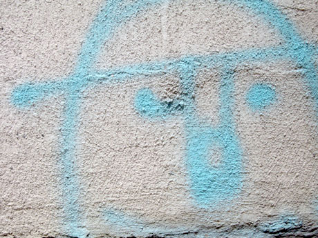
happy saturday- or well, what's left of it. I find myself tonight in NYC! I guess in retrospect it probably isn't the most ideal time to be travelling across the nation, what with scary fire bombs going off in airports and increased security and all... but alas, the big city calls. I'm only here for a few days, but hoping to soak up lots of visual fun, as the city never fails to provide. If you're an NYC happy mundane-er that happens to catch this, i'm here til tuesday- let me know if there's anything new I should check out- here's the view from my hotel tonight (I'm right by TimesSquare) The one exciting thing so far is that I got to play with one of those new iphones at the big apple store on 5th. oooooh fun! it's really really cool. I even tried calling someone at it worked! anyways- Tomorrow (sunday) i'm hittin' Brooklyn! stay tuned...
 The one exciting thing so far is that I got to play with one of those new iphones at the big apple store on 5th. oooooh fun! it's really really cool. I even tried calling someone at it worked! anyways- Tomorrow (sunday) i'm hittin' Brooklyn! stay tuned...
Friday, June 29, 2007
Surf Shack Chic
 Today on AT:LA I posted the final two designers from the 1.7 Ocean showcase homes. These were my favorites as they embodied the surf/skate/retro so cali lifestyle that makes living here in OC special. Check out the post here. I love the green/seafoam colors both designers used, and all the vintage paintings... great inspiration if you're looking for some summer freshen-up ideas for your place.


Diesel: super holographic cool
ooooooh- special effects!! check out the super cool holographic effects at the Diesel "Liquid Space" fashion show for Spring/Summer 08 (it's kinda long...)
here's the preview for it-
Thursday, June 28, 2007
Todd Oldham's door pulls
 I LOVE these branch door pulls that Todd Oldham used in his treehouse that Design*Sponge mentioned and House&Garden is featuring on their site. I also love the cool wood veneer design in the background. I betcha you could do something fun like that with contact paper... hm... more ideas....
Decorating with straws
 You can always count on Anthropologie for fun display ideas, and this one really seemed perfect for summer. They used simple white and clear bendy drinking straws in lieu of flowers. It looked great paired up with the green/blue tones of the glass and japanese-ish pottery plates. They even connected a few together for height that resembled modern branches. Might need to try something with straws at home... (I think I saw a pack of those straws at IKEA)...
Wednesday, June 27, 2007
Lamp idea at 1.7 Ocean
 I've been posting over at AT:LA, coverage of the 1.7 Ocean event. 1.7 Ocean is this new housing development in Costa Mesa, CA, and they recently had an event that brought together lots of local OC design/fashion businesses and the featured attraction were 4 showcase bungalows that were done by local interior designers. Inside one of them, by designer Andrew Virture of Andrew Virture Desgins, I spotted this fun little lamp "hack". All the homes at 1.7 Ocean come with these Ikea FADO lamps, and Andrew added a little vintage flare to it. He placed a vintage double tiered lamp shade on top. I think it looks great and is a fun idea to customize a pretty basic shape. It worked well with the rest of his vintage/surf inspired decor. I'll be posting a tour of the bungalow he designed later today... but check out this bungalow from designer Natalie Umbert, and this one from designer Mo Brias.
Tuesday, June 26, 2007
No. 10 Letterbox
 Saw these really great and clever mailboxes in the July/August 2007 Dwell magazine. Created by Mark Naden of Pure Design, I love how functional the design of your basic envelope is. I love how the barcode is actually perforated so you can peek inside! Available here, but unfortunately looks like they're sold out right now, but hopefully they'll get more in soon! (Image via Dwell)
Tuesday distraction...
(sigh) It's only Tuesday. Here's a litle distraction... "won't you join me?"
"It's everything you've always wanted to do... and Audrey Hepuburn's the one you've always wanted to do it with..."
"It's everything you've always wanted to do... and Audrey Hepuburn's the one you've always wanted to do it with..."
Monday, June 25, 2007
Blue Munday: Perfect backyard
 Well, I think I've found my perfect dream backyard! This backyard is from the July/August 2007 Metropolitan Home. It's part of Michael and Kathleen Ferguson's gorgeous Los Angeles house. It's ideal for me because it's totally low maintenance, has enough of a patio to hang out on, has a great view, and just the right size lap pool. (Oh, and I love the blue patio chairs too!) Insert me where the guy is swimming, and I'd be one happy camper. (I'll even take the dog too!)
Friday, June 22, 2007
More books in Elle Decor july/August 2007
Recently picked up the latest July/August 2007 Elle Decor, and noticed a few interesting things- One- I am soo jealous of the house of Trina Turk. I posted it on AT:LA. Soooo lovely. Next, I saw two more interesting treatments for books in a bookcase. You'll recall the white on white thing I mentioned before- Well, I spotted this detail in this image for Lauren Henson's home. At first, I was intrigued with the gold color on the spines, and thought they had done something similar to the white slip cover thing- but upon closer inspection, I realized that all the books were facing backwards- with the spine to the back of the case. This seems really weird to me, and I wonder if it wasn't just something done for the photoshoot. How would you know what book it was without seeing the spine? I do like the visual look, but just not practical. Unless you never planned on reading them and they were purely for decoration. I do like how the painting sits on top and in front of the bookcase. I've seen it done before, and think it's a great way to add some interest to a bookcase.

And then a few pages later, there's another cool bookcase idea. This time involving visual "colorblocks". Here, they've intentionally mixed their collection of what seems like National Geographics, and clumped them into big groupings that form these yellow rectangular graphics. What a great way to utilize a big collection ! It adds so much punch and color. Sadly most magazine spines are hardly ever the same color, but perhaps a large book collection of similar colored spines could be used to achieve a similar look. There's been much blog talk of arranging your books by color, but perhaps instead of a simple rainbow effect, you could mix it up into color blocks? What do you guys think?
 At first, I was intrigued with the gold color on the spines, and thought they had done something similar to the white slip cover thing- but upon closer inspection, I realized that all the books were facing backwards- with the spine to the back of the case. This seems really weird to me, and I wonder if it wasn't just something done for the photoshoot. How would you know what book it was without seeing the spine? I do like the visual look, but just not practical. Unless you never planned on reading them and they were purely for decoration. I do like how the painting sits on top and in front of the bookcase. I've seen it done before, and think it's a great way to add some interest to a bookcase.
And then a few pages later, there's another cool bookcase idea. This time involving visual "colorblocks". Here, they've intentionally mixed their collection of what seems like National Geographics, and clumped them into big groupings that form these yellow rectangular graphics. What a great way to utilize a big collection ! It adds so much punch and color. Sadly most magazine spines are hardly ever the same color, but perhaps a large book collection of similar colored spines could be used to achieve a similar look. There's been much blog talk of arranging your books by color, but perhaps instead of a simple rainbow effect, you could mix it up into color blocks? What do you guys think?

Thursday, June 21, 2007
Ben Loiz Nike Joga Bonito mural
 I recently picked up the Summer 2007 issue of Plus 81, a japanese design magazine. The Summer issue is their "west coast" issue and features tons of the great designers from here on "the west siiiide.."- One piece that really caught my eye was from designer Ben Loiz, who created this really fun mural for Nike's Joga Bonito campaign last year. To create the mural, he basically took a soccerball and dipped it in paint and bounced it up against the wall to create a print. I'm not sure how they got it to be so perfect, but there's a movie on his site that shows the process. Pretty neato! I'm not sure if it's still up, but if anyone is in the LA area, the mural is apparently on Suplveda Blvd, at 4310 Suplveda... I'd love to do this in a room somewhere.... like a blank wall in front of a dining table or something.... kind of like those pieces from Damien Hirst- Check out Ben's site for more coolness...
Wednesday, June 20, 2007
Ando and friends
 I picked up a t-shirt recently from a brand I hadn't heard of before. It's a surf brand called Ando & Friends. It's done by artist Andy Davis, who has his own personal site for his artwork.

 I was just immediately attracted to the simple, happy, and somewhat innocent quality of his work and designs. Perfect for a lazy summer day by the beach...
A little sauce-y
 Was in Crate&Barrel yesterday and fell in love with this little little soy sauce pot! It's only $3.95 and in a fresh spring green color.
Tuesday, June 19, 2007
House Industries: Artist Proof vol. 2
 For those graphically inclined, I just got my copy of the latest catalog from House Industries, highlighting their Artist Series vol.2 of stock images. This latest collection includes some great vintage inspired patterns, textures, and backgrounds. I love the rich groovy jewel tone colors they have on the front cover, and all the bronze metallic accents they put in.
 Also interesting is all the collaborative project/merchandise pieces they have throughout the catalog that are for sale. There are a ton more that are not featured on the site, but are showcased in the catalog.


Click over to their site- tons of pretty color and pattern inspiration...
Corn Zipper
 I love corn. I used to love doing the whole "typewriter" thing when eating corn on the cob as a kid... (ok, I still do...) But as I've gotten older (no comments from the peanut gallery) I've found that the whole picking corn out of your teeth thing started to get kinda cumbersome. Then I saw somewhere people would cut the corn off the cob with a knife and then eat the pile with a fok, which seemed so much more... civilized? Anyway- now I see this handy gadget (via Outblush) and ... MUST... HAVE!! Any of you use one of these? Do they work?
Monday, June 18, 2007

Blue Munday: Graphic Blues pillows
 Happy Munday! Summer is in full effect here, and I'm yearning for poolside lounging. I love this graphic pillow that totally sets the tone with it's retro-inspired wavy stripes.
Thursday, June 14, 2007
WYWO 2.4 the finale
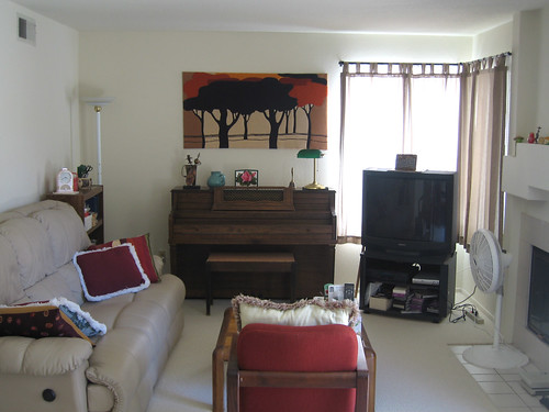 So FINALLY, here is the end result of my parentals family room redo. Pictured above is the before (here's the link to an explanation)....And here is the after.
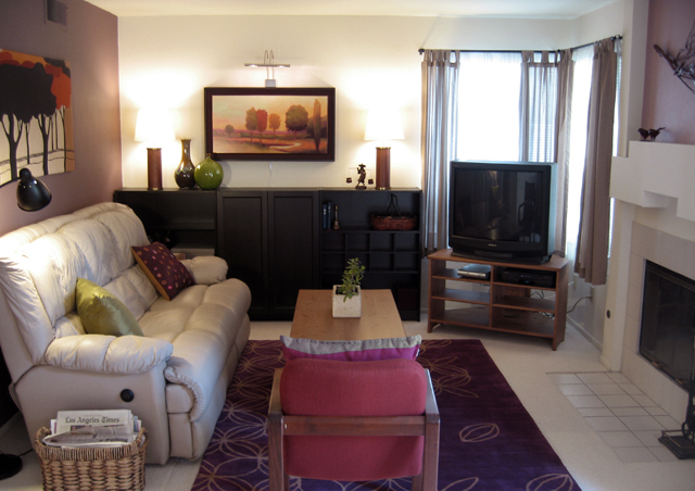 (Here is link one, two, and three for refresher.) Now, it's not a major overhaul, but at least it feels more cozy, and definitely has more color. As I mentioned, I couldn't really move the furniture placement, and I was forced to keep the TV where it was due to the cable box location. Since I had only really had one weekend to complete this, the biggest thing I did was move the piano out (that sucked. I highly recommend hiring a professional!), and replaced it with more shelving/storage. I also added some paint to the walls for contrast. The artwork above the black bookcases really tied everything together for me, after using the pillow as initial color inspiration. The parentals were happy though, so I guess it's all good.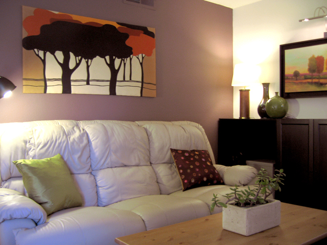
 In case any of you were wondering, here's how I made the branch artwork above the wall. I simply took an old branch, hot glued some wooden "biscuits" that came in a prepack at the craft store...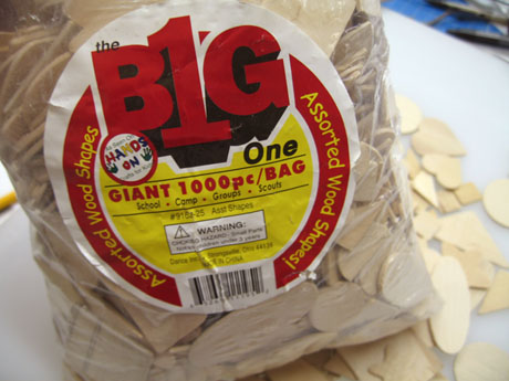

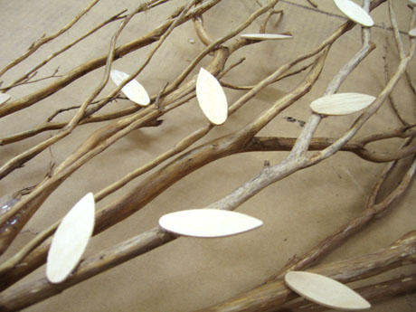

 I actually was contemplating leaving it just natural, but the room called for it to be painted darker- so I spray painted it with a mixture of three metallic spray paints, a dark bronze, a shiny gold, and a medium matte- gold. I then sprayed/misted a little black on it to "age" it a little. I mounted it to the wall by placing some strategically placed nails under certain branches. It's so light that it held up fine. For the rest of the stuff, I got most of the accessories from Target (the two matching lamps were a major steal- Victoria Hagen lamps on clearance for $15 each!) or HomeGoods, and as mentioned, the big pieces from IKEA.
It's been an interesting exercise doing this room, since this is the room my parents use the most. Here, there were many instances where I had to make a conscious choice to not get something I may have put in my own home, because I knew my parents might not necessarily share the same sentiment...or "get it." Anyways, I guess that's all part of the drill when you design a space for someone else. Next up, I've been asked to attack the master bedroom or the downstairs guestroom. Stay tuned...
Subscribe to:
Posts (Atom)

 Posts
Posts


