 is it half empy or half full?
is it already thursday? or only thursday...

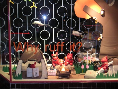
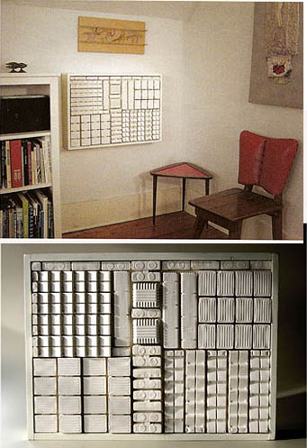
 I got an e-mail recently asking me about the "circle things" in one of my flickr pictures, so I share with you its story. My stairwell in my house leads up to an open area. There is a half wall that surrounds it on the top, leaving quite a bit of space before you actually hit the ceiling. This leaves it very light and airy. However, this also leaves it sort of bare and boring. I wanted to put something "architectural," like some sort of screen or perhaps a slat wall to fill the space. (I still might do the slat wall... but not right now.) Anyways, I always loved seeing those geometric built-in partitions in old 1960's houses. Then one day, I was on Third St. in Los Angeles, and went into this store called Puppies and Babies. A super cute shop that has things for... puppies and babies... Anyways, their front window display had this cool circle screen thing made of metal.
  Now of course I couldn't afford to have a metal screen made, but I had ideas on how I could fake it. Fast forward to me on the floor, with scattared wooden dowels, messy hot glue, and embroidery hoops. The orginal plan was to do the entire space, but I stopped after four rows. I simply repeated the pattern of dowel spacer, hoop, dowel spacer, etc... Then I painted the whole thing the same white as the wall and ceiling color. And to attatch it? more hot glue!
 Obviously this is not structurally sound, but then, it wasn't meant to be. As long as you don't touch it- it's fabulous! (and don't get too close to inspect it either, else you see all my sloppy craftsmanship.) Anyways, it's amazing what a little hot glue can do.


 Fashion designer Mary Jo Matsumoto was so kind to tag me on her "things you may not know" questionaire, and she featured my answers today on her fun site Trust your Style. So if you happen to be curious, check it out (and NO, that image on the stamp of the woman in the pink wrap is NOT me!! hehe) But definitely check out her blog to see her other stylish finds- (thanks again Mary Jo!)
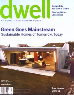 This month's Dwell magazine chock full of good things. There are some really great articles about sustainable homes, and also some great "mundane" visual treats-
 Then, there's this super cool air-conditioning cover by Leslie Fry. She was inspired by the plastic inserts that are used for cookie packaging. Isn't that fantastic?
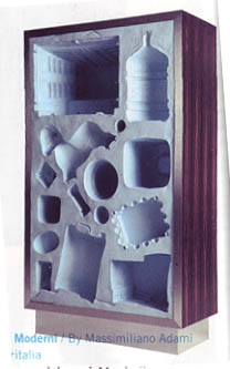
 And finally this "fossil moderni" by meritalia.... I love the hollowed out shapes of these everyday object... overall, great issue- check it out!
 Also, last night I was able to see Little Miss Sunshine. Incredible movie, and I highly recommend it. I laughed, I cried, and I had Rick James stuck in my head (you'll have to see it to understand)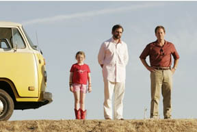
 On my last trip to Palm Springs, I took some photos of a few of the new housing developments that are happening out there. There are quite a few exciting new modern homes being made that pay hommage to the classic mid-century ones that Palm Springs is famous for. This one is from modernlivingspaces. Personally, I'd love to live in one of these. You get the mid century mod styling, but completely updated and new (and therefore no need for additional thousands of dollars in renovation that a typical MCM house would require...) The only thing I'm weirded about is many utilize septic tanks. Being raised in the suburbs, this concept is completely foreign to me. But I guess I could get over it. I'm excited that there are some brave developers that are offering modern-styled houses, as opposed to the tuscan/miditerranean/terra cotta tiled madness that is so prevailant in suburbia right now. Someone just needs to make some closer to home. Anyways. Cool houses...(sigh) I want one. Dare to dream on this first monday of August!
 I became a huge fan of J. Otto Seibold when I came across his first book about Mr. Lunch. Since then, I've been faithfully following his work and books. However, once again, nobody told me that he has a new one out! The Fuchsia is Now, is Seibold's latest story.
  I know these books are intended for kids, but his style is just so darn cool, they can totally be appreciated by us "grown ups" as well. He's also recently done a project work with Target. He did all the illustrations for Target's Ready Sit Read program, as well as the flash animation for the site. When I was in the store recently (shocking, I know, me, in a Target... hehe) I stopped by the food stand and got a drink, and was happily suprised that it came in a cute Seibold illustrated cup!
  Seibold, also known as "jotto" also has an incredible site that showcases his Jottoworld, however, as of today I noticed his site (jotto.com) is strangely down or not working. But keep checking back, I'm sure it will come back up soon, because it's well worth it! Also looking forward to his next book- Quincy, the hobby photographer-...
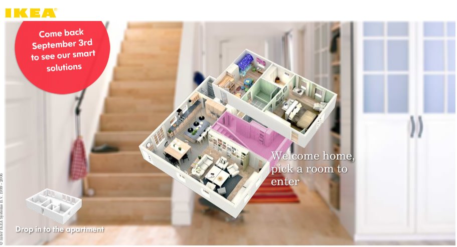
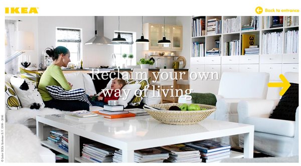
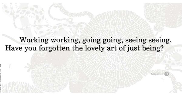 Whoever is doing the copywriting at IKEA needs to get an award, because they are brilliant. Was checking out IKEA's website this morning, and if you scroll down a little, I noticed the little box on the bottom that says "Celebrate Your Everyday Life...
 Dimitra sent me a nice e-mail introducing me to her cool shop in Toronto, called UptoYou. She has a fantastic selection of items by designers from around the world. One item that immediately caught my eye was this "soda cup." This Soda Cup takes the bottom half of your standard bottle and by simply casting it in porcelain, forces you to recognize its beautiful form. It was designed by Maxim Velcovsky, for Qubus. By the way, UptoYou ships worldwide, so you can get a set right now! (thanks Dimitra!)
 So I've already talked about my circle thing, but now I'm noticing a new shape popping up everywhere- the hexagon- especially for the wall- Target offered a 3 set of nesting tables/wall hexagons in their current Bronze Age collection, as well as West Elm's version.
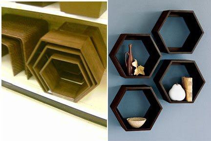 Walter wall applications has this "hex" style, which are paintable and conveniently backed with 3M adhesive.
  Plushpod offers these "hive" wall shelves, which are made by Boom design-
  Boom design also makes these neat Twist cubes and "hive" cubes, for stackable storage.
 Bees use the hexagon as their shape of choice for their honeycombs, so I guess it's only natural that designers be inspired by it as well. I think it's refreshing to see it getting all this buzz (sorry, bad pun.) Are any of you noticing hexagons too? Or is there another shape that's craving for attention?
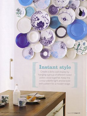 Happy last day of July 2006 (can you believe it?!) For this weeks blue monday, I bring you a clipping from the August 2006 Living Etc. I love this cluster of blue plates. I guess it goes with my current circle thing. Plates are great and fairly inexpensive to collect, and can make such an artistic statement when grouped in a large number like this. I also love that they mixed traditional motifs with contemporary ones, all united by the color. (I just don't want to know what would happen if there was an earthquake...) Have any of you done something like this?
 The other night, I had the opportunity to have a quick overnight stay at the Westin, in Vegas. I was there for the LV Market- but only there for the day. I have never really paid much attention to their paraphernalia, but this time, when I got my card key- I was immediately struck by the simple beauty of it. I believe they have several designs, but the one I got was this beautiful butterfly wing. And actually, all of their current "stuff" had amazing imagery. Of course, this just shows what a design geek I am. I "stole" all their printed stuff (as opposed to the normally expected bathrobe or shampoos!) anyways- I love the soft muted colors and photos. I took this gift bag that was in the closet, and the little pad of post-its that had a cute koi fish.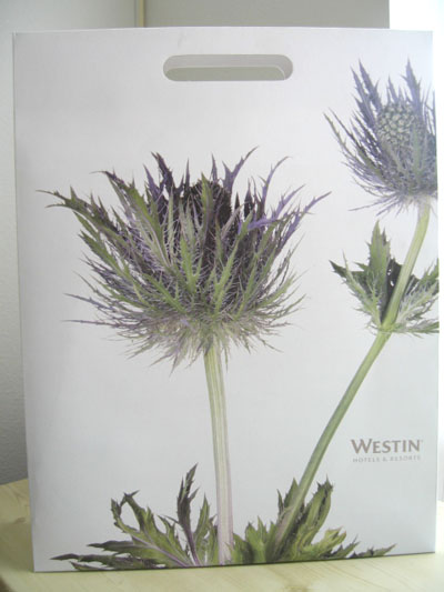
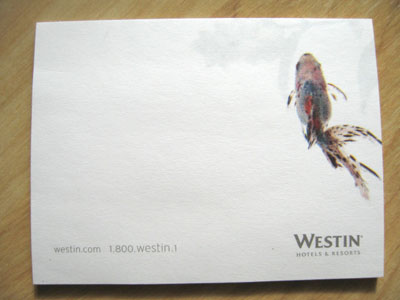 The Westin itself was pretty nice. Just off the strip, not tooooo design-y- but still stylish and modern, and the best part... their "heavenly beds"....
 and this interesting three tiered "Sandbox" jewelry box. It is actually made of sand, cast in resin, and totally reminds me of Luke Sykywalker's aunt and uncle's house on the planet of Tatooine.
 This will come out later in August, and is $88... Christmas is only 150 days away!!
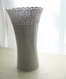 I recently picked up this great gray ceramic "eyelette" vase from Anthropologie. Much like my over obsession with pillows, I have waaaay too many vases, and fully admit to having a problem. However, in true addict form, I could not resist the beauty of the gray (grey?).
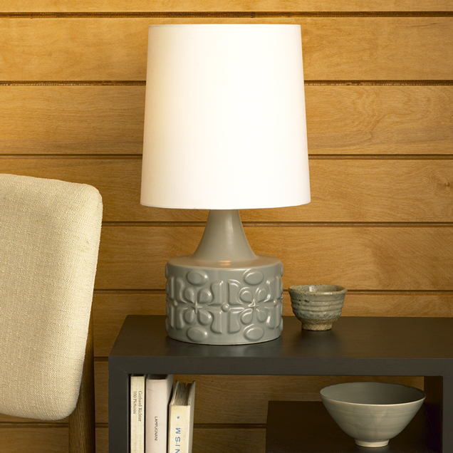
 I also love this lamp from West elm.
  And finally, while not exactly "gray", I'm also loving these smoked/"double dipped" glass tumblers at Pier1.
 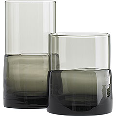 Is anyone else feelin' gray? (in a good way)
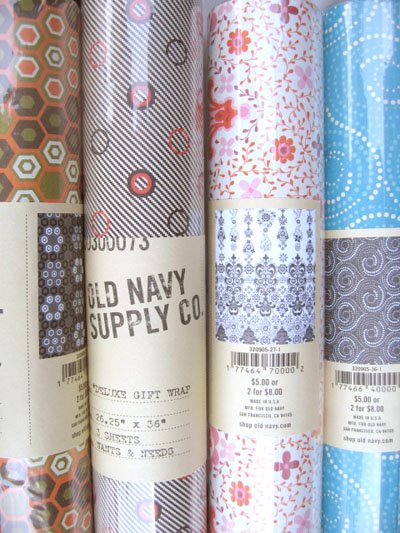 Who knew that Old Navy had wrapping paper? and pretty cool ones at that. however, they seem to be on sale/clearance already (and I didn't even know they were out there!) Anyways- these are the four styles I picked up- Maybe they still have some at an Old Navy near you? They're not on their website, but has anyone else see these in store?
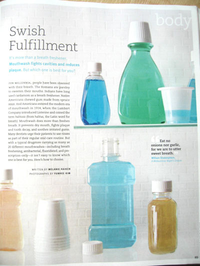 It's blue monday, and with the heatwave that is over us, I was relieved to look at mundane-ly beautiful images of cool and refreshing mouthwash. Those clever folks at Real Simple did it again with this great editorial story. Amazing images by Yunhee Kim. I love the containers that are stripped of logos and type, revealing the soothing colors of the liquid. If I could get a mouthwash bottle that was devoid of graphics, I wouldn't have had to go on my mission awhile ago, however, I am still happy with my current container.. anyways- check out the August issue- I thought the article was really informative...
 Just wanted to highlight an amazing house tour/slideshow I posted up on Apartmenttherapy:LA this afternoon. Tyke and Jon (not me, a different one) have an amazing home in Topanga Canyon, CA. I was introduced to them from Tracy, who we featured in a previous issue of Poplife. I love the mix of old and new, warm colors, and excellent balance of comfy and coolness. Check it out at this link here. Unfortunately comments were disabled on the post, but feel free to gush here!
 Ok- I promise this is the last gushing of Target's Independent Studies line. So please humour me with my last piece. I bought this notebook, that was in their back-to-school supplies section. They've extended the whole "bronze age" collection into stationery and office stuff, like message boards for lockers (which actually could be great in your kitchen, or by your front door, etc..) folder, desk accessories, and more. I loved the watercolor imagery. But what I especially appreciated was that on the front cover, they actually had a big sticker that credited Deanne Cheuk, and gave a short bio on her. Props to Target for highlighting the talent, and also inspiring other would-be artists in pursuing their artistic dreams.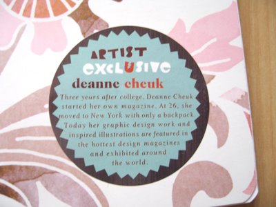
 I love these bird feeders now available at Sprout Home. The colors are gorgeous and they remind me of those ones that are made out of gourds. I actually have a real gourd one that I found at garage sale awhile back.
  This dear old lady actually hand painted these butterflies and dragonflies on them.. but.... sorry dear old lady- I really want to just paint over it and make it a solid color (I know, I'm terrible... I steal candy from children too...) I'm hoping to finish it sometime during this summer, to accompany the feeder/light thing I already have on my tree. Speaking of fabulous bird feeders,
 there's also these sexy things from good ol' J.A. and also this Vessel Architectural Pottery one from Velocity... do any of you guys have bird feeders too?
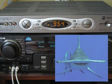 Today, while watching my morning tv, I started staring at the cable box, and noticed that it kind of reminded me of a face... like that of a hammerhead shark. It was kind of funny, all silver and staring back and me. It totally reminded me of this book, Face to Face, by Francois and Jean Robert.
 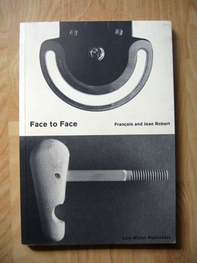 This book is an oldy but goody, having first been published 10 years ago, in 1996. I think I've had it since then, but its one of those few books that I find myself really going back to looking at frequently. The book is filled with these fantastic photographs of everyday objects. There is no manipulation to these. Just good old fashioned cropping, straightforward photographs, and the title "face to face." It's funny, I bet, if there wasn't the mention of the word "face"- I probably would look right past these things, yet, with that word stuck in my head, I automatically look for the face.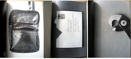
 It suddenly gives everything around you a personality. It really shows how our perception of the world can change just by the way you see it. What do you see?

 Posts
All Comments
Posts
All Comments


