Wednesday, May 16, 2007

Aldo Londi + Ceramics by Bitossi

The Interior Design magazine's March 07 (sorry, i'm kinda slow) 75 anniversary edition, featured a spread on the ceramics of Aldo Londi for Ceramiche Bitossi, produced by Flavia. Last year the cdompany reissued a bunch of Londi vases from 1950-1970, relying on the original techniques and documents wheever possible. They are a-m-a-z-i-n-g. I am obsessing over the orange cat. Check out all the other reissues / or "re-editions" in their catalog section at the Flavia website.

Tuesday, May 15, 2007

WYWO 2.2: Needing a buffer.

The first major issue that I had to tackle for the parental's family room makeover was color. You have this retro 70's orange/black/tan vibe vs. the purple/pink/dark browns look that sort of flows in from the living room. So whattyagonna do? I've always found that when you're trying to make contrasting colors blend, the answer is what I call, buffer colors. This basically means colors that you add in to form a new colorstory and help transition all the colors together.When I try to decorate any room, it usually helps me to start with one object/thing/inspiration that ties together all the colors. Granted, this isn't always needed, but it always helps me. It can be found in anything... a piece of artwork, or a fabric... a tchotchke... anything... After looking around, I actually realized I already had found the answer. A pillow I had purchased awhile back for them from Pier 1. The shimmery silky fabric had all the colors from the living room, but also some new colors, like some greens and the orange I was trying to figure out how to incorporate. The key color it turned out was that green. I needed to inject some olive-y yellow-y greens to act as my buffer color. So... now that I had a color game plan, I could move on to the next step... figuring out what to get rid of and what I needed to get... (to be continued)...

Monday, May 14, 2007

Blue Munday: indigo sea prints

Happy munday. This is a crazy week for me. I'm under a huge deadline for work, and I'm leaving out of town this friday for a super quick trip. Here's a little calming visual eye candy. These "Indigo Sea prints" from West Elm. Looks like they used that "sun print" paper to create these. I love that sunprint paper. So much fun. I actually used them for a promotional piece a few years ago, going with the theme of "exposure". Get your own sunprint paper here, or get these framed beauties here (and they're on sale!).

Friday, May 11, 2007

David Weeks Ulterior Votives for Kikkerland

Like a moth to a flame, burned by the fire... my love is blind, can't you see my desire? that's the way love goes...- Janet JacksonThere is something mesmerizing about staring at an open flame isn't there? That was the inspiration behind these super cool little "hearths" from designer David Weeks for Kikkerland. Weeks was inspired to create "hearths" for the urban dweller. Inspired by the concept that "an open flame inspires personal reflection, but modern urban life offers little time for meditative moments and limited access to a fireplace." So, Weeks created his "Ulterior Votives" collection, which uses a standard tealight. There is a mini Chimnea, campfire, and oil drum, all made in slip-cast porcelain. They're only $20, and will be available starting next week at mxyplzyk.com, as well as design stores throughout the country. The best part is that they made these hillariously cool videos of each one. Love the deer with lazers and the funny knitted toys!


Wednesday, May 09, 2007

Sunny Days

It's been so hot lately here in OC and So Cali, that I've got sun on the brain. Recently, as I browsed through Banana Republic, I spied their credit card application. I like the abstract sun that kind of reminds me of some sort of 50's vintage block print, but is really made up of silhouettes of clothing (so clever). This for some reason got me thinking about lemons. Do you enjoy iced beverages with lemon? My only pet peeve is when I suck up a seed while drinking with a straw. Grrr... hate that.
Anyways- Here's a couple fun sun-inspired things I've spotted recently:"radial pillow" from Hybrid Home


Utopia Sun ornament by Jonathan Adler"Starburst" (ok, not specifcally a sun, but the sun is a star right?)
mirror and bowl from Crate&Barrel
"Drawing the Sun" book by Bruno Munari

Tuesday, May 08, 2007

While you were out: The second season

So last year, I was given the daunting task of redoing my parents living room. (click here, here, and here for reference. And here's a link to my flickr set on the completed living room) It was all made possible by the fact that they had left for a long boat cruise somewhere, which left the house free for me to do what I needed to do. Well, this year, my parents went away again, a slightly shorter trip, but I was left again with the task to continue what I had started, and move forward to the "family room". This room has always bugged me. It's a very awkward space. Plus, I have the added wrench thrown in that they have this gi-normous leather couch (it reclines... ooooooh...) and it has to stay. The other challenge is, my mom has this 70's stretch canvas fabric art that she loves (I love it too) but somehow it has to blend in with the purple/pink vibe I started in the living room. Other than that, there's this big piano- awkaward shelf, horrible halogen lamp, and not much color. I did already have a head start, in that when I got window treatments for the living room, I also got the same ones for the family room. Anyway... the challenges were:
1) work with existing couch.
2) integrate Orange into existing color scheme, and transition it to new space.
3) warm up the space.
4) get it done before they get back.
Click here to see my additional notes on the "before" room on my flickr page.
Stay tuned for what I ended up doing, but I'd love to hear how you'd tackle this?

Monday, May 07, 2007

more blue munday: Slurpie

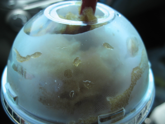
It's a hot one out there today in OC. It's... 90 degrees!!! I think I need something nice and cooling, like say, a big ol' cola Slurpie...

Blue Munday: Elsewares goodies

Happy Munday...Here's some pretty blue goodies currently at Elsewares.
Love this "Blossom Pillow" and "Plant forms repeat" pillow from Three Sheets
also love these "geranium napkins"
and there's something really interesting about these dragonfly coasters too...

Sunday, May 06, 2007

Tord-mania!: the book

Last Christmas, HappyMundane went into a bit of a Tord Boontje frenzy as his beautiful designs were featured at Target. Holly at Decor8 sent me an email telling me that there was a book coming out about him, and I ordered one right away- Last week my copy finally came! The book documents almost all of his work and gives insight to his inspirations- all the way up to his Target collection and the present. The book is pretty extensive and thorough. Its pretty thick and substantial as well! The cover has this neat white mesh that is integrated into it. Also many of the pages are perforated with this cool pattern. I love seeing his pieces placed in a natural outside setting, as well as many of the detail shots they included. It's also fun to see his earlier work and photos of his studio and past. A must have for any Tord fan or modern design lover. Get it here:

Friday, May 04, 2007

IKEA Stockholm Collection

If you're going to IKEA this weekend, definitely check out the new Stockholm Collection. They've totally stepped it up a bit, and these new pieces are so great. The pricing is slightly more expensive, but you can tell the quality is better than their normal stuff. They're totally reminiscent of classic danish modern styling. I posted some shots from my store visit over at AT:LA today. (click here to see) My favorites are the coffee table and the tv bench. The dining table and coordinating chairs were pretty sweet too. They are giving out a cool little catalog as well. It has a pretty varnished design of this signature leaf pattern that is used on several textiles in the collection. (sorry, it was hard to photograph the varnish). Here's some other shots from the catalog:UPDATE: Shelterrific also posted a few shots from the catalog- check them out!
UPDATE2: link to the IKEA mini site for the collection here

Tuesday, May 01, 2007

I <8 the AppleTV ad

Ok- yeah the new Apple TV is cool and all- but have you seen the commercial for it? I think the real star should be whoever designed the background set. It's so amazing! The color scheme is so pared down to grey (swoon) neutrals, yet, it still feels warm and "lived in". I love all the subtle touches they threw in too, like all the funny props- ie. The toy in the study, the little bird scupltures on the desk, the great white vases in the grey kitchen, all the coordinated books, the weird portraits on the wall in the living room, even the little succulent plant on the coffee table! No detail was spared- even the matching white washed/faded bricks when the camera pans through the wall. Plus- can we talk about the speakers (I think they're speakers) in the living room set up? They look like gorgeous sconces, and blend right in- Also- I am in love with the backyard set they have too. Where in the world did they get that bench?! This probably is not a real house but I totally want to live there! View the commercial here.

Monday, April 30, 2007

Blue Munday: Maré collection

Happy munday. Love this "Maré" collection from Crate&Barrel. All the pieces have that rustic hearty feel, and they're made in Italy. I think they'd add a nice warm and home-y touch to any kitchen. My favorite piece is the utensil holder. (Doesn't that seafood look yummy?!)

Friday, April 27, 2007

Every Man Jack products

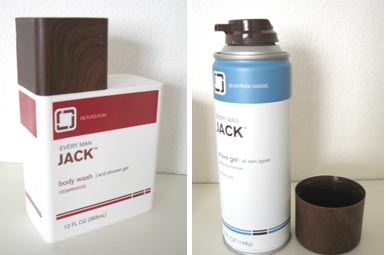
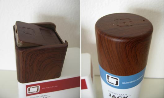
As posted by Men.style.com and Notcot, Every Man Jack launched at Target recently. Of course, being the faux bois obsessed, I had to check it out firsthand. So... off to Target I go (again... hehe. yeah, twist my arm). First off, it was a little hard finding. I thought it would be in their new specialty products section, where they have the new Boots line and also where I got my Sharps stuff. But no. They weren't there. In fact, they turned out to be in the normal shaving section, by the Gilette and razors section. Anyway, they're pretty cool. The packaging is brilliant. The faux woodgrain looks great, and I love that they embossed the logo too. Totally modern and fun. There's even witty verbage on it that play off the word "jack"- Each product has different text. However, the caps on the shaving gel are made of metal, and sadly, the woodgrain scratches off pretty easily. They had versions that were fragrance free, as well as their "signature" scent, and a tea tree scent- but I went for the cedarwood. The best part was they were all around $4.99 each. I haven't had a chance to try them out yet (I got the shave gel and body gel) so I'll report back later. Check them out next time you're in store.

Domino covers

There'a an interesting discussion going on at AT:NY, about how Domino is going to start trying out two different cover formats. One that is more clean, and the other that is normal with lots of type. The clean version would go to subscribers, much like what Wallpaper magazine does. I personally love my clean Wallpaper versions, which was added motivation to subscribe. There's also debate about the bold color bar for the masthead. Personally, I don't mind it at all, and actually like it. It gives a distinct look on the newstand, and as a graphics person, I've always been drawn to colorbars. What do you guys think?
(UPDATE: thanks to Dani for showing me the other version of the May cover- I've updated the image- not shockingly different...)

Thursday, April 26, 2007

Through the looking glass...

A very mery un-birthday to you! I've always had a thing for the story Alice in Wonderland- especially the original etching illustrations. As spotted in the latest BetterHomes&Gardens, there is now a new collection of dinnerware with the Alice in Wonderland imagery. Apparently this collection is in partnership with Books of Wonder, and Fish's Eddy produced the collection. Check them out here! I think my favorites are the tall glass and oval platter!

Wednesday, April 25, 2007

MSL May 2007 pt 2: Stamped books

Another "good thing" I spotted in the May 07 issue of MSL, was this fun idea to stamp the sides of your books. It makes for a great way to personalize them, as the sides of books are so often neglected. I remember in grade school, I used to doodle on the page side of my books. I don't always stack my books upright, and this would also make it easier to find certain books, when the spine isn't visible. There's so many great stamps out there now, such as this vine pattern I saw recently, or this quirky crow. This could be a fun project to do with kids too, and as the photo suggests, also a neat gift idea for Mom?

Tuesday, April 24, 2007

Martha Stewart Living May 2007 pt1

During my usual stop at the magazine stand, I picked up the latest issue of Martha Stewart Living, mainly because of the key words "...Color Issue". I've always found inspiration from the color combos that the team at MSL come up. So, I figured this would be worth a pick up. Don't let the kinda, eh, cover shot fool you. Do you see all the orange stickies at the top? That's all the "good things" that were inside! Chock full! What should have been the cover, in my humble opinion, is this shot from the intro page of their color section. The page has some interesting facts about color, but really, it's the photograph that is what's so memorable to me. I totally want to make some sort of art project with sticks of colored chalk now! Another thing that I want to try are these ravioli made with beets. They look so weird, yet kinda pretty at the same time. Have any of you tasted or made beet ravioli?Anyway, there are so many great ideas, I'm going to have to break this post into few segments. But if you're by the newstand, definitely check it out! (to be continued)

(all images from Martha Stewart Living May 2007)