Tuesday, May 01, 2007

I <8 the AppleTV ad

Ok- yeah the new Apple TV is cool and all- but have you seen the commercial for it? I think the real star should be whoever designed the background set. It's so amazing! The color scheme is so pared down to grey (swoon) neutrals, yet, it still feels warm and "lived in". I love all the subtle touches they threw in too, like all the funny props- ie. The toy in the study, the little bird scupltures on the desk, the great white vases in the grey kitchen, all the coordinated books, the weird portraits on the wall in the living room, even the little succulent plant on the coffee table! No detail was spared- even the matching white washed/faded bricks when the camera pans through the wall. Plus- can we talk about the speakers (I think they're speakers) in the living room set up? They look like gorgeous sconces, and blend right in- Also- I am in love with the backyard set they have too. Where in the world did they get that bench?! This probably is not a real house but I totally want to live there! View the commercial here.

Monday, April 30, 2007

Blue Munday: Maré collection

Happy munday. Love this "Maré" collection from Crate&Barrel. All the pieces have that rustic hearty feel, and they're made in Italy. I think they'd add a nice warm and home-y touch to any kitchen. My favorite piece is the utensil holder. (Doesn't that seafood look yummy?!)

Friday, April 27, 2007

Every Man Jack products

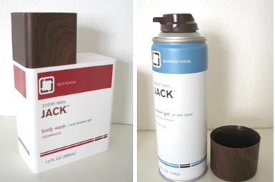
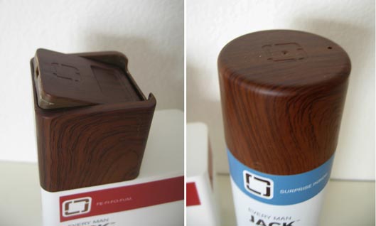
As posted by Men.style.com and Notcot, Every Man Jack launched at Target recently. Of course, being the faux bois obsessed, I had to check it out firsthand. So... off to Target I go (again... hehe. yeah, twist my arm). First off, it was a little hard finding. I thought it would be in their new specialty products section, where they have the new Boots line and also where I got my Sharps stuff. But no. They weren't there. In fact, they turned out to be in the normal shaving section, by the Gilette and razors section. Anyway, they're pretty cool. The packaging is brilliant. The faux woodgrain looks great, and I love that they embossed the logo too. Totally modern and fun. There's even witty verbage on it that play off the word "jack"- Each product has different text. However, the caps on the shaving gel are made of metal, and sadly, the woodgrain scratches off pretty easily. They had versions that were fragrance free, as well as their "signature" scent, and a tea tree scent- but I went for the cedarwood. The best part was they were all around $4.99 each. I haven't had a chance to try them out yet (I got the shave gel and body gel) so I'll report back later. Check them out next time you're in store.

Domino covers

There'a an interesting discussion going on at AT:NY, about how Domino is going to start trying out two different cover formats. One that is more clean, and the other that is normal with lots of type. The clean version would go to subscribers, much like what Wallpaper magazine does. I personally love my clean Wallpaper versions, which was added motivation to subscribe. There's also debate about the bold color bar for the masthead. Personally, I don't mind it at all, and actually like it. It gives a distinct look on the newstand, and as a graphics person, I've always been drawn to colorbars. What do you guys think?
(UPDATE: thanks to Dani for showing me the other version of the May cover- I've updated the image- not shockingly different...)

Thursday, April 26, 2007

Through the looking glass...

A very mery un-birthday to you! I've always had a thing for the story Alice in Wonderland- especially the original etching illustrations. As spotted in the latest BetterHomes&Gardens, there is now a new collection of dinnerware with the Alice in Wonderland imagery. Apparently this collection is in partnership with Books of Wonder, and Fish's Eddy produced the collection. Check them out here! I think my favorites are the tall glass and oval platter!

Wednesday, April 25, 2007

MSL May 2007 pt 2: Stamped books

Another "good thing" I spotted in the May 07 issue of MSL, was this fun idea to stamp the sides of your books. It makes for a great way to personalize them, as the sides of books are so often neglected. I remember in grade school, I used to doodle on the page side of my books. I don't always stack my books upright, and this would also make it easier to find certain books, when the spine isn't visible. There's so many great stamps out there now, such as this vine pattern I saw recently, or this quirky crow. This could be a fun project to do with kids too, and as the photo suggests, also a neat gift idea for Mom?

Tuesday, April 24, 2007

Martha Stewart Living May 2007 pt1

During my usual stop at the magazine stand, I picked up the latest issue of Martha Stewart Living, mainly because of the key words "...Color Issue". I've always found inspiration from the color combos that the team at MSL come up. So, I figured this would be worth a pick up. Don't let the kinda, eh, cover shot fool you. Do you see all the orange stickies at the top? That's all the "good things" that were inside! Chock full! What should have been the cover, in my humble opinion, is this shot from the intro page of their color section. The page has some interesting facts about color, but really, it's the photograph that is what's so memorable to me. I totally want to make some sort of art project with sticks of colored chalk now! Another thing that I want to try are these ravioli made with beets. They look so weird, yet kinda pretty at the same time. Have any of you tasted or made beet ravioli?Anyway, there are so many great ideas, I'm going to have to break this post into few segments. But if you're by the newstand, definitely check it out! (to be continued)

(all images from Martha Stewart Living May 2007)

Monday, April 23, 2007

White on white (vicariously): hotel puerta america

So last week, a few of you commented about the impracticality of living in a white on white room. I totally agree, for myself, since while I do love the concept (obviously), I know I could personally never completely live that way. However, that's where cool boutique hotels come in! Thanks to some inspired designers, you can live in a white on white world, and then leave and not worry about the upkeep! My friend Em recently went to Spain and she brought back these amazing pictures of a white on white room she stayed at. It was of the hotel Puerta America, where every floor has a different theme, designed by a renowned designer. The floor Em stayed was by Zaha Hadid. It looks so spacey futuristic- I love it! Note the awesome graphics on the bedspread too.
More great pictures at Em's blog, Supercozy. Have any of you stayed in a great white on white hotel room?

Blue Munday: rain, more kylie, and jason brooks

I always love it when it rains at night. What is it about the calming nature of the sound of rain? I filmed a few seconds of it from last night's april shower we had here in Southern Cali...


Anyway, as much as I like the rain, I've been seeing so much summer driven product lately, that I've actually been itching for a little fun in the sun... poolside... A few Blue Mundays ago, I posted an image from the H&M campaign for the new Kylie Minogue swim line, and now they have a full blown commercial for it.


(sigh) Doesn't lounging by the pool sound nice right about now?

anyway- which brings us to a way to have both rain and sun, via the always sexy stylings of illustrator Jason Brooks. Jason Brooks offers prints on his website, allowing you to always have a little fabulousness to gaze upon, no matter what the weather is outside. Here are a few of my faves that go with my current state of mind. Have a great munday!

Thursday, April 19, 2007

Paper Towel flash cards

Last September, I posted about paper towels and toilet paper patterns, another example of "white on white". Hannah, over at Wet Foot Publications/Piebird press, also found inspiration in their sublte textural beauty, and sent me a great email and was so kind to send me a sample of her Paper towel pattern inspired notecards! It's part of a series she calls "Know your household products." Basically the set of flash cards has the name/brand of paper towel, and its corresponding pattern on the back- in letterpress!! I love it! I think my favorite is from Kirkland. She's working on a swatch card set inspired by dish soap colors- how cool is that?! I'll keep ya posted... There are some great cards over at the wetfoot/pie bird website- check them out! (thanks Hannah!)

white on white books

Here's another thing I spotted in the Crate&Barrel catalog. I loved this bookcase of all white books. I know it's unrealistic and only a background prop, but I wonder if you couldn't replicate it by covering your books with some sort of vellum or tracing paper? Probably waaaaay too much work for what it's worth, but it sure looks sharp doesn't it? to be continued...

Wednesday, April 18, 2007

White on White

Every year, I love Living Etc's "White" issue- What is it about "White on White" that is so appealing? Perhaps its that when you take away all the color, (or when you use just one color), you are forced to recognize everything else, like shape and texture. The other night, I stopped by Crate&Barrel and loved these Chiseled Hurricanes. I couldn't tell what material was on the outside, but whatever it was was fused onto a glass cylinder hurricane. Then the surface was chiseled away, leaving this interesting and very modern looking pattern, which when illuminated, gave off an amazing glow. They're kinda $pendy, ($79.95 and $89.95) so when they o on sale, I'm gonna grab me a small one!
One thing I totally noticed in the Living Etc. issue was how this one lady painted her logs. They recently showed this idea (of filling your fireplace) a few issues back, but I loved the fresh look of painting them purely for decoration. I could see this looking pretty cool, just as a bundle. Like if you painted one of those log stacks you always see outside the supermarket. It would be like a sculpture.

Anyways- what do you think of white on white? I'll have a few more tomorrow...

Tuesday, April 17, 2007

Poetics of the Handmade

Over the weekend, the LA Times featured a cover story about a new exhibition opening this month at MOCA, called "Poetics of the Handmade". It's an interesting read and looks to be a great show. The artists involved have taken mass made, common everyday objects and transformed them into powerful statements. I was particularly struck by Chilean artist Livia Marin's installation called "Fictions of a Use"- which has 2200 tubes of lipstick in 27 colors, with the tips molded in 600 shapes. It's a statement less about women's use of the cosmetics, but more about "the makr of an individual on the mass-produces object," recognizing that "every lipstick adopts a particular shpae in relation to whoever uses it." All of the artists involved in the show are from Latin America. Other pieces included in the show will be this gigantic sculpture made of Q-tips, and a mural made of discarded currency. Read the entire article here, and more info on the exhibit, which opens April 22, here.

Monday, April 16, 2007

more blue munday: Blue Pelican books

Look at this awesome collection of Pelican Books over at Ace Jet 170- (images from Ace Jet 170) The covers are just stunning! Do any of you have any of these? I gotta start keeping an eye out!

blue munday: paper vacuum in Real Simple

Happy Munday. I continue to be impressed with Real Simple's paper sculpture art they've been using for their division pages. April 2007's issue had a cleaning supply theme, which always holds a special affection with me. The fact that it was all in blue tones too didn't hurt either. The sculptures were created by Matthew Sporzynski (click on his name to more of his amazing pieces) and photographed by Monica Buck. My favorite is the vacuum cleaner. The April issue had some great ideas for organizing as well as some interesting facts I did not know about. I am planning on trying some of the tips for organizing my laundry area, which I'll update later (after I actually do it) and here is a link to their fascinating article about "how safe is your kitchen?"

Friday, April 13, 2007

TGIF!

Happy FRIDAY! woo hoo! hope you enjoy it, (despite the fact that it's friday the 13th)
if you get the chance, have a sexy party!...

Thursday, April 12, 2007

New shades of grey

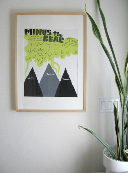
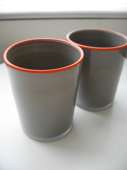
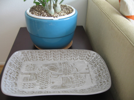
As many of you recall, my great Grey obsession of Summer 06-(and which still continues today)... well, I thought I'd give you an update as to how that has affected me. Here are a few new grey things that have recently somehow... miraculously...(hehe) come into my life... First, is my new print from Patent Pending Industries. Oh joy did a post about them awhile back, and I couldn't resist this one. Next up are these awesome glasses I got at Maison Midi, which is connected to the American Rag store. I got these at the one in Fashion Island. This was another example of weakness, but c'mon- grey with fluorescent orange trim detail? Wrap it up! Maison Midi is a great place for unique dishes and glasses. I wish they had a website, but alas, I guess they're keepin' it old skool. Finally, I had been longing for the Jonathan Adler Money tree platter from his Utopia Collection ever since I saw it at the NYIGF. However, it was just too much for me to afford. Then, they had that big sale recently, and lo and behold, the platter was on sale too! I'm so happy I got it, and it was a great deal cuz now it's not on sale anymore! It's not really techinically grey, but it looks grey-ish due to the finish. Speaking of JA, I have always regretted never getting one of his aorta vases, which he doesn't make anymore. If anyone knows where I might still be able to find one, please let me know.... Have any of you added any grey things into your lives lately?
Wednesday, April 11, 2007

funny...

Thought this site was hillarious! Thanks to Miss Chiffonade for pointing it out-

Tuesday, April 10, 2007

Tree Blocks

Remember Lincoln logs? Well, I randomly came across these real wood toys, but I kinda find these much cooler! Welcome to the world of Tree Blocks! I don't know if they're originally from the UK, or if they're based out of Santa Barbara (perhaps its the US distributor?), but they say they're "elves" so... perhaps that would explain the mystery. The UK site looks more developed, so my money is on them as originators. Anyway, regardless, their toys are so great. The pieces are made from reclaimed wood, discarded from paper forests. I love that many pieces retain the actual bark. How Lord of the Rings is this house set? And these sets could look amazing simply as sculpture on a coffee table or in a bookcase. The most stunning are these "toad stools" but sadly they're apparently out of stock (boo...) What fun huh? As we say over at I(k)NW, "wood is good!"

Monday, April 09, 2007

I REALLY found it!

One of the columns I love about Domino is the "found it" where they try to find something they've seen and come up with either the actual thing, or a really close alternative. Well, this month's "found it" was a little dissappointing. The writer saw this leaf "garland" at a friend's house, and ended up finding this other garland, but honestly, the two are sooooo not the same.However, I am proud to say, that I actually "found it!"- Well, at least found something that looks very very similar to the original photo. Turns out it's not "garland" at all, but rather a metal sculpture. It's actually a little heavy, and I'm suprised that whoever owns the original was able to secure it to the mirror, but I guess it's totally possible. Anyways- I found this metal sculpture at a recent estate sale. It was a bit expensive, but I kinda just went for it. I don't think I'm going to have it in my house.. but I may use it in another project, or re-sell it... but anyways- what do you think? Did I "find it"?