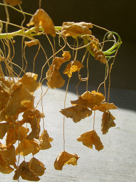
I love this. (more here, here and here.) (thanks Christopher for the tip!)
 About a year ago, I posted about Mike Perry's last book, Hand Job: A catalog of type. He recently came out with a new one called Over & Over, published by Princeton Architectural Press. This time, it's all about hand drawn patterns! Mike has compiled a bunch of great examples from a variety of artists.


 This is a great reference and packed with inspiration to have on hand if you're a designer, but also just full of fantastic eye candy even if you're not. Here's a little video of a quick (and, uh... kinda blurry) flip through so you can get an idea.


 If you're in the OC next weekend (Saturday August 23, 2008), there's a show opening at the Surf Gallery, which will feature the work of Andy Hughes from the UK.
  Andy's work is absolutely stunning. He takes photographs of found beach trash!
  Definitely check out his site (and he also has a blog!) for more of his amazing eye. Click here for info of the Surf Gallery. (all images Andy Hughes)
 I've been meaning to post this for awhile- Back in the July 2008 issue of Real Simple, they had this great piece called "Can these bathroom's be saved?" Basically, it's all about working with what you got. I really appreciate editorials like these. It just goes to show how it's possible to make something seemingly "horrible" into something beautiful through pairing it with the right color combinations and just looking at it with a fresh set of eyes. I love all of the outcomes. I especially love how they added the yellow into the pink bathroom- such an unexpected solution, yet completely transforms and updates it to such a happy place!
  Also love that wallpaper in the brown bathroom. (drool...)
 Check them out here.
 While in Vegas, I checked out the recently opened Palazzo Hotel. The shopping center part is connected to the Venetian's Grand Canal Shops via a brand spankin' new Barney's New York store. The Barney's store there is huge, fabulous, and gorgeous. Of course all that walking and (window) shopping can make ya hungry, so I checked out Mainland, a fun restaurant that's all about noodles. Here's a link to an interview with the creator of it.
  The atmosphere is fun, I loved all the graphics.
  The food looked amazing. I had a kiwi soda, that you could tell was made fresh with real kiwi juice and soda water.
  My only gripe was everything I ordered was a teensy bit... bland? I ordered this green tea noodle salad,
 and my friend ordered the ginger beef. Both were nice- it wasn't bad, but we both felt it could use a little more... salt? soy sauce? The presentation was great, but even the kiwi soda, could have used a bit more sugar? Maybe I was having a bad taste sensory day. Service was fine, staff was nice. I dunno- I would definitely go back and try something else, maybe the soupy noodles, so... it's worth a try...
 (bonus points if you know what movie the title of this post comes from) So my friends, I'm in Sin City this weekend for a friend's birthday. The last time I was in Vegas was about 2 years ago. I stayed at the MGM Grand's "West Wing", this time, I thought I'd try something different and ended up at Caesar's Palace in the Palace Tower. I stayed in a "Palace tower Deluxe room"- Click here for a virtual tour (it defaults to another room so you have to click on the map at the bottom left).

 Who knew it would be so posh?

 It was quite lovely. The rest of the hotel is kinda... eh. (By the way, if you're a fan of buffets (as I am), unfortunately, the one at Caesar's isn't very impressive. the one across the street at the Flamingo was better...) Anyway. Room really nice. Bathroom great. Pool eh. rest of Hotel, eh. 3.75/5.

 Totally love this editorial in the latest issue (#3) of Corduroy Magazine. Pink paper silhouettes inspired from runway shots and shoe collages.
 Created by the awesome Florence Tetier. There's another editorial in the issue, where she collaborated with Nicolas Coulomb and they used these animal silo cut outs.
 Definitely check out the issue on newstands now.
 But now that I'm changing things up, I've been looking for a new piece of art to set the tone. I think I may have found it. I actually was planning on using this vintage piece I got at one of my local thrift stores in my bedroom, but haven't found a good spot for it. I do now!
  Put it in the bathroom! It's carved wood set on top of a sort of burlap-y/fine wicker ground. I haven't mounted it yet, so I'm just setting it up there for a few days to see how it feels... So far so good... It definitely flows with the bedroom better... kinda swanky, no?


 I wish this shot was about something more happy. I have to imagine though, this must have been quite a striking and moving image in real life. "Hundreds of paper lanterns float on the Motoyasu River, in front of the gutted Atomic Bomb Dome, for a memorial service honoring victims from Hiroshima..." Image by Katumi Kasahara for Associated Press. Another shot here.
 Just an update to the bathoom painting- The first brush strokes on the wall are always such a thrill. This was especially so this time because of the dramatically darker color I was going with. The only problem with painting a dark color is that everything shows up against any lighter surfaces. I only painted two of the walls in the bathroom, opting to keep the rest white. This meant that a lot of touch-up paint was required. It also required three coats to get it looking smooth. Anyway- the room is done.
  The color isn't showing up exactly right in the photo but it's a really deep dark blue-grey color. I went with "Silent Night" (D55-5) from Olympic Paints (from Lowes). Now that the walls are done. I feel like everything else has to change. The artwork, the towels, the bathmats... I'll keep you posted on the progress...
 Every time I go to Fashion Island in Newport Beach, I always pass by the Irvine Financial Building and oogle at the pretty mural sculptures that are outside.
 They are so midcentury mod- marvelous. This past weekend, I took a few minutes to actually walk around and see them up close. The murals were made by local California artist, Tom Van Sant.
 These murals in particular were made in 1968. He's done quite a few pieces around town and in other locations, like Hawaii, that I've seen and always admired, but never knew who made them. Here's a list of his work and timeline.
  I wish I could find more documentation on his other work, anyone know any other links?

 Posts
All Comments
Posts
All Comments