Over the weekend, I got a nice email from artist Linda Solovic. How adorable are her pieces?I love the playful happy embroidery work that has a slight vintage feel to them. Love these magnets too!
  Check out more at her website, and her etsy shop.
Over the weekend, I got a nice email from artist Linda Solovic. How adorable are her pieces?I love the playful happy embroidery work that has a slight vintage feel to them. Love these magnets too! Check out more at her website, and her etsy shop.
Check out more at her website, and her etsy shop.
Over the weekend, I got a nice email from artist Linda Solovic. How adorable are her pieces?I love the playful happy embroidery work that has a slight vintage feel to them. Love these magnets too! Check out more at her website, and her etsy shop.


 Woo hoo! My copy of the AT book was waiting for me when I got home Friday afternoon! It's soooo neato. Ok, not that I'm in any way biased (er... not that my place just happens to be in it, or that I happen to blog for them too, hehe) but it's such a fun book! Ok, yeah, I'm totally plugging it, but really, I definitely recommend checking it out if you love house-tours. There's such an array of styles, colors, and tastes in this book, and they're all of homes from people like you and me. So much great inspiration and it's a substantial size too!

 The images of my place were shot last year, so its funny to see how it has changed since then. (if you've been following this blog, you'll probably notice a few things, but my place is still pretty similar to when it was shot.) I took some updated shots on Saturday, and should be having an official house-tour on AT in the coming weeks. (hopefully I won't get blasted with too many snarky comments, hehe) Anyway- I think my favorites inside are: "hakarl and jili's bold bright moves", "jane and darko's cozy thicket", "tyke and jon's topanga casa", "victoria's bomo pad" and "marilyn and peter's home studio." oh! and "gregory and emily's silverlake sanctuary" and "marlon's blue pad." See- there's just tooo many to choose!

 So the past few days I had a little house guest. His name is Lucky. I was only supposed to be baby sitting for two days. You may not see me for a awhile because I may or may not be involved in a kidnapping...
 I really do... Most medical packaging is so crazy or clinical, and I love this more calmer approach. Also love the fact that the outside is made of molded pulp! Read more here. (be sure to click on the "Bored?" tab, it's genius. (via mocoloco)
 Recently I added a new piece of artwork to my stairway wall. It's a pretty substantial piece (its the one on the left above- It's really long horizontally, and I love the 70's modern city scene with the brown/rust sun. Consequently, when I took a step back, I found that it didn't work so well with one of my existing pieces. (see below- the existing painting is the blue gradation one) The piece that was now affected was one that I actually made myself. There's no real deep emotional attatchment to it. At the time, I just wanted to put something up to bring in some color to the wall.
  So, my thought was to actually modify the existing art, to make it work a little better with the new piece (uh oh- watch out- Jon's gettin' "artsy", hehe). I mean, the canvas is the perfect size, and it's still in great condition. No need to waste good canvas right? Looking for inspiration, I always find myself paying attention to artwork and details in the background sets of some of my favorite style movies. One example is in the beloved film, Pillow Talk. I took some screen caps of some artwork in the film that caught my eye. It's interesting how well these pieces hold up nearly 50 years later...


 Isn't this cover of the latest Inside Out magazine just so perfect for spring? I love the fresh green and turquoise accents. Another thing I loved inside this issue was this image of this amazing sculpture. It's by the son of Sharyn Storrier Lyneham, Luke Storrier. I love how it's a whole bunch of toothpicks forming a sort of web, with the red ceramics trapped inside. So poetic...

 Check out this cool flat pack hammer by Vert Design from Australia. They also have a super cute flat pack whale mobile!
 check out more at their site.
 Well lookee here! Remember last fall, I posted about my "dipped" branches? Well HM reader Tessa was kind enough to point this out: "Kim Myles just did this on her HGTV show! Maybe she saw it here first... " OMG! really?! As luck would have it, I actually had the episode Tivo'd and sure enough, check it out!


 It could just be a case of "Great minds think alike..." but I would be so thrilled to think that something I did on this mundane blog could actually inspire an idea for a television segment! How cool would that be?!
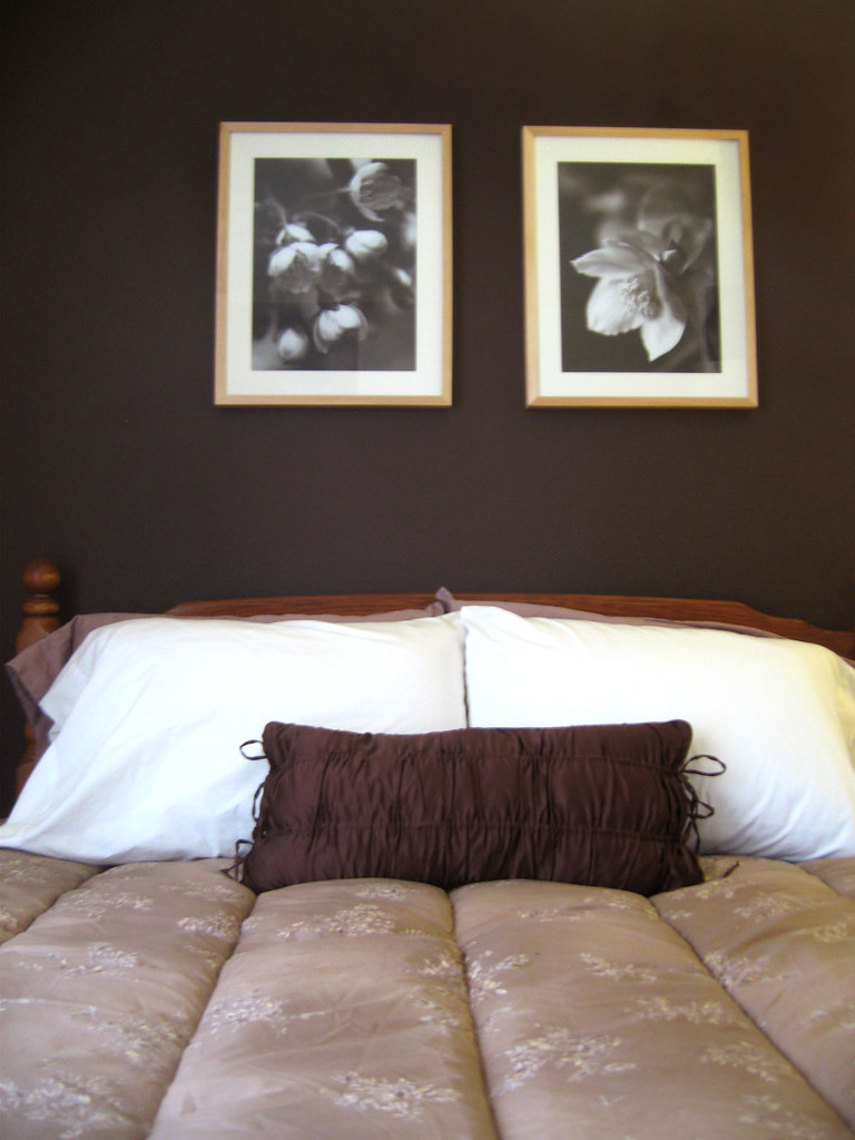 So here are the final results of the guest bedroom make-over! I think the most dramatic difference was simply painting the walls. I chose to paint only the main back wall and the adjacent wall that the door is connected to. The other two walls (there's actually a closet opposite the bed, and then the other wall has a small window) I left white. The second thing that had big impact was to put some floor-to-ceiling curtains along on the entire wall with the window. It helped camouflage the window size (which is a little small), and it added some subtle drama.


 As I mentioned before, the initial inspiration was this room that I saw on AT:Chicago, but color-wise, I went in a different direction. I found this incredible bedding from Calvin Klein. Ye-ah. It was pretty much the most expensive thing in the room! But I just loved it and it was so perfect for the parentals. The room was so small, that really, it was pretty much the focal point of the room, so I figure, why not splurge a little, (it was for the parentals right?) It was on sale when I got it (although apparently not anymore), so that helped (got it at Macys).
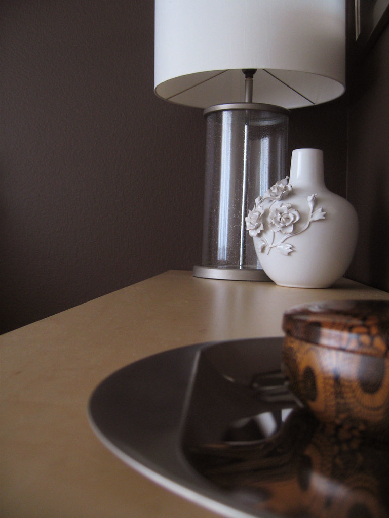 Here's the info on the rest of the pieces if anyone is interested:
 OMG. Where has this been hiding all my life?! salivating. drooling...
 So much hotness in the April 2008 British Elle Decoration. I am in love with this Parisian apartment. I don't think I could actually live like that, because I am just not fabulous enough to pull that off- but, if I could- I am so there.
  I love all the white, the mix of modern and old. I especially LOVE how they painted the fireplace grey- and then took that paint and graphically extended it up and over, across the ceiling, and then all the way to the other side. Genius. And then in the dining room, the neon plexi box over the chandelier?!
  That's just too much hotness right there.
 I also love how it looks like there's a spray painted gradation in the hallway, but I think it's just the photo and the lighting (but how cool would that be if it really was gradated like that?!) I have to go sit down now...
 Check out these plastic bag animals that are tied to subway grates. They totally would freak the bejeebus out of me, but I'm still totally fascinated with them at the same time. More info from here. (via Craftzine via Drawn)
 Snow covered tulips! It was fun to see the vibrant burst of color lightly covered in fresh fallen snow. anyway... it was sunny when I got back but now this morning its all grey and cold. So... its tuesday. and I'm wishing I was here:
 So I have to travel off again today- work has me going up to the lovely state of Washington, (which I visited just a few weeks ago- hello again Seattle!) In the meantime, the lovely Jan over at Poppytalk was so kind to do a little post on some of my collections as part of her "Collecting" series. Click on over here to see them (thanks Jan!)
 I'm a little tired, as my flight is suuuper early, so I'm feeling a little deflated- which brings to mind the amazing work of Susie MacMurray who I found via Designers Block. Susie makes these incredible pieces out of deflated balloons! Amazing. Check out more of Susie's work here


 So, as mentioned at the end of tuesday's post, here is the guest bedroom of the parentals. It's super tiny. I tried to get a good shot, but it's so tiny, I couldn't even do that. All sorts of random going on there. It's like this is the room where all unwanted or unused things go to die.
 As you can see, the bed pretty much dominates everything. I tried to move it around, but it pretty much has to be where it is. So, unfortunately, I can't get rid of it. My parents said they want to have a queen size bed in there for guests, and also another consideration- it has to be somewhat the same height because many of my parent's friends are older and don't want to crouch all the way down (ie. cool modern platform bed.) So... basically that means, I can't touch the bed. So what to do?... Well, one thing to point out is that this room is visible if you're sitting in the living room. So, if the door is open, you will see inside. Therefore, the color scheme should sort of transition or match what's going on outside of it. The way the house is set up, if you pass the guest bedroom, you then enter the kitchen and family room area. My first inspiration was from this post over at AT:Chicago.
  The colors are so spot on with what I did for the rest of the house! But what I really loved was the dark chocolate brown wall, which I think will do well in the guest bedroom. I think it actually makes the room feel bigger. It "visually makes the wall recede." (I just had scary flashbacks of a certain someone who "pops up" on a show from time to time.) Luckily, this room is so small, it shouldn't take too long to give it a little facelift... stay tuned...

 Posts
All Comments
Posts
All Comments