Wednesday, May 10, 2006
decor8
Super big thanks to Holly over at decor8 for featuring Happy Mundane as her "blog of the week"! Welcome to any new readers to my humble blog- please feel free to peruse the archives (on the right) to see other happy mundane-ness- (thanks Holly!)


Tuesday, May 09, 2006
dermond peterson
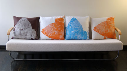 Susan Peterson, one half of Dermond Peterson, was so kind to have sent me these amazing pics of her most recent collections. I couldn't wait to share some of them with you! For those unaware, Dermond Peterson is a small artisan/manufacturing company out of good ol' Milwaukee, Wisconsin. Every single piece from their collection is block printed by hand using environmentally sensitive, water-based inks that are free of solvents or other pollutants. The designs are somewhat simplistic, yet striking and extremely sophisticated. I remember the first time I held one of their pillows, I immediately felt the quality of the fine cotton linen fabric and was in awe of the organic richness of the prints themselves. For her latest collection, Dermond Peterson have used the ocean as inspiration. My favorite is this fish print they call "Dory"-
 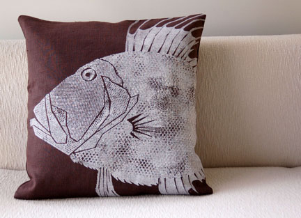 There's something kind of raw and powerful about it that reminds me almost of a fossil of some prehistoric fish- but the vibrant colors offered bring a modern edge and bit of whimsy as well. Check out all of their amazing catalog on their website. You can also contact them for a location near you that carries them. Sorry, I'm drooling again as I look at these- Don't you agree???! (thanks susan!)

magazine o-rama- O at Home
 This month in magazine world is chock full of amazing and inspiring images! As seen in the latest Summer '06 O at Home, I love this page that features Leslie Steven's cottage bedroom. What I'm particularily attracted to is the "Coral Reef" bedding by Garnet Hill. I just LOVE the simple collage-like fish graphics and bold and fun colors!! The combination of the green bedspread, with the hot pink side table, mixed in with the yellow lamp and balanced with the white vase and white sheet accents is just... fearless! Just goes to show how you can don't have to be set into a simple two or three color scheme- done in moderation, you can use them all! Its neat to see how the sheet set really sets the tone and ties it all together. You can get the set here.
Monday, May 08, 2006
blue monday: pottery
 One of my favorite things to do while visiting Palm Springs, is of course, vintage shopping. One of the best places to do that in P.S. is at Antiques 111. Currently they have two locations, one in Palm Springs, and one further down Highway 111, in Cathedral City. The Cathedral City location has more little tchotchkes, and therefore, is more dangerous to a weak weak weak vintage collector as myself. This being said, you can understand that I was defenseless against this amazing turquoise vase/pitcher. Not exactly sure where I'm going to put it, but who worries about little details like practicality when one is blinded by beauty.
Friday, May 05, 2006
pigeons

 I realize there are a lot of people that don't like pigeons, but sometimes if you really look at them, they can be kind of pretty.... sometimes... These shots were taken while at a shopping center in Hawaii last year. I'm off to a quick to trip to Palm Springs. Have a great weekend!
I.E.R.Moodboard
Earlier this week, I posted about how I was obsessed with this Isaac Mizrahi pillow and felt it would be a great starting point for a room... if only I had an extra one. So... I've been playing a little throughout the week, and created an "Imaginary Extra Room" (I.E.R.) moodboard, using the pillow as a starting point. I had fun virtual shopping for things I'd put together and with a little photoshop magic, this is where I am so far.... I realize its kind of bare, and still needs a lot more...(but this is imaginary, so I'm not going to sweat the details!) I opted to start by "painting" the lower half of the walls with a golden yellow. The couch is from Crate and Barrel, and the orange accent pillow and vases are from Jonathan Adler. I thought it would be fun to mix it up by trying a rolling ottoman/cube that was in canvas and has a cool cargo pocket, that's actually from the "kids" section at Target. I can't remember where I found the wood block rug, but I saw one similar at West Elm. In hindsight, having a wood block rug could be a little weird on a wood floor.... so... that may need to go... The sideboad and painting are from Ebay, and the floor lamp is from West Elm. What would you add into this I.E.R? Let me know in the comments or shoot me an e-mail and I can add them in. Sky's the limit!

Thursday, May 04, 2006
papel picado

 In honor of friday's Cinco de Mayo, I thought I'd post about papel picado,which are those mexican paper cut-out flags. In Kate Spade's store windows, they strung up a bunch of them, and in this month's Martha, they showcase them as a "good thing" to use as party placemats. The combination of their lace-like intricacy and bold colors counjures up many other uses I'm sure... I could seem them decoupaged onto a glass vase or affixing them onto a window to use as a screen. Since most are made from tissue paper, be careful of getting them wet, because the colored ones will bleed and stain. You can get some online here. I especially like the "Day of the Dead" ones because they have happy skulls on them. Has anyone ever done anything with these?
Wednesday, May 03, 2006
Kate Spade in The OC
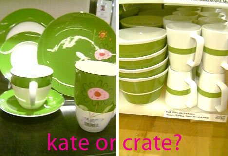
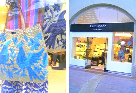 I stopped by Fashion Island last night and saw that the new Kate Spade store has just opened! This marks Kate Spade's first Southern California free standing retail store. It's always interesting to me when a big company decides to open a flagship store here in the OC as opposed to Los Angeles. I guess the affluence of this "west coast Riviera" is appealing, and perhaps the proximity to the beach doesn't hurt either. Anyways, I'm sure the Kate Spade store will do quite well in Newport Beach, as it was pretty busy when I took a look-see. What I love about her stores is the tchotchke things she puts in to further promote the lifestyle. Happy colors, eclectic and witty books and objects, and a perfect blend of preppy chic and contemporary lifestyle. Also on display was the Kate Spade dinnerware. I always love seeing her trademark kelly green china, although was hoping to see the kids line I saw in Elle Decor, but sadly it wasn't there yet. Speaking of kelly green china, I noticed that Crate&Barrel has a nice set in a similar colorway. Which one do you like better?
  By the way, the Kate Spade store is at Fashion Island, Newport Beach 949.219.0785
Tuesday, May 02, 2006

garden roof

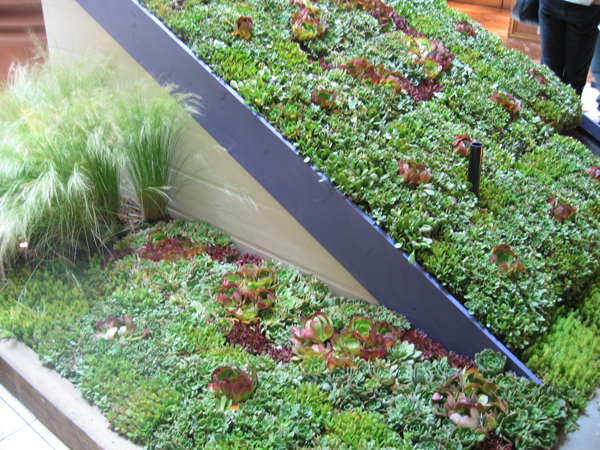 As I mentioned yesterday, over the weekend I attended the Spring Garden Show, at South Coast Plaza. The mall was filled with floral exhibitions on each floor and it was so nice to see that Spring has sprung! One of the displays that really caught my eye was this "garden roof" that was put together by the cool folks at Flower to the People and The Original Living Wreath. They made a faux rooftop where they planted a garden of succulents. I love the idea of using your often neglected roof space, and bringing in nature. It provides insulation as well as a valuable habitat for birds and butterflies in the urban environment. Plus, succulents are so easy to care for ( I know this because it's the only thing I haven't killed in my garden) so it's also pretty maintenance free. On Flower to the People's website, you can see a similar project they completed for a showcase in Beverly Hills.
mundane tea towels

 BowieStyle over at Print and Pattern just tipped me off on these fun "mundane" tea towels- I love the one with the "under the sink" graphic and the yellow one with the kitchen utensils laid out. Also the one black and white saucer one too! oh too much fun and too many to choose from- They are from London based Unity-peg. see more there! (Thanks BowieStyle!)
Monday, May 01, 2006
Blue monday: mouthwash bottle found!
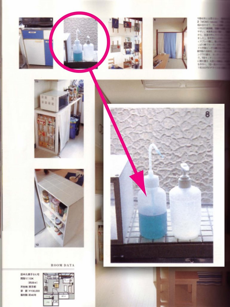 A couple of weeks ago, I was on a mission to find a more aesthetically pleasing, as well as more functional mouthwash container. I was all set on using a glass carafe that I found from Crate & Barrel. However, I realized that some of the same issues I had with the original mouthwash bottle, would still be there with the glass one. Then I found my answer. It was in a tiny picture in a japanese magazine. The clouds parted and the solution was clear: I needed a plastic squirt bottle! I realize it isn't as classy as the glass carafe, but I just loved the utilitarianism of it. Instead of still dealing with trying to pour a heavy liquid out of a bottle and into a cup, rinsing out the cup, having the excess water drip down the sides, yadda yadda yaddda- the squirt bottle option is far more convenient and functional. The only downside was trying to find one. Luckily, and randomly, I went to check out the Spring Flower show at South Coast Plaza. One of the exhibitors was selling the squirt bottles (intended for care of african violets) and it was exactly what I was searching for. It also works well with the other pharamceutical inspired tchotchkes I have going on in my bathroom... If anyone knows where to find the bottles online though, please let me know!
Sunday, April 30, 2006
isaac pillow = I.E.R.M.
 Ever since Em told me about Isaac's latest collection, I've been obsessed with this pillow. Something about the unexpected color combination just stuck with me. If I had an extra room, I think this piece could be an amazing "starting point." So, in an effort to get this obsession out of my system (since I really don't need ANOTHER pillow), I'm doing a little exercise called an Imaginary Extra Room Moodboard (I.E.R.M.). It's sort of like that Kohler commercial where the lady puts the faucet on the table and goes "Design a room around this..." Do these colors inspire you? I'd love to hear your thoughts... and what you might do with a room in this colorstory... my solution later this week... stay tuned..
Friday, April 28, 2006
Preserve Toothbrush
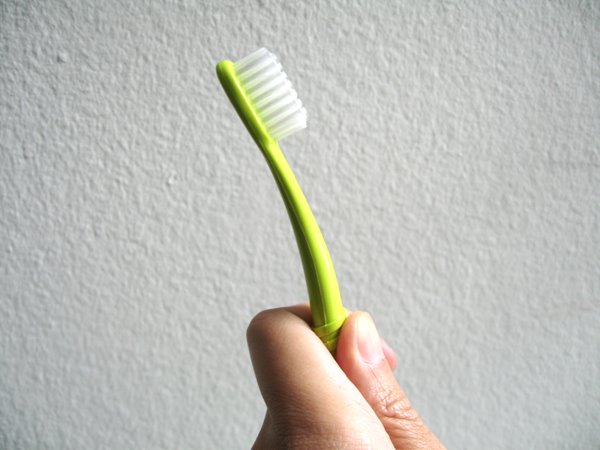 I recently received some info about Recycline products. The company was founded in 1996 by Eric Hudson to provide"high-quality recycled products in response to the growth in the recycling" and the growing concern for the environment. They have a great line called Preserve, which includes table wares and also personal care products. They sent me a sample of their new Preserve toothbrush- and first off, it's such a clever design. I LOVE it. It's been "dentist-engineered". What I love about it is that it curves backwards, unlike most toothbrushes- it actually feels more ergonomic. But what really got me was that they included a postage paid mailer.
 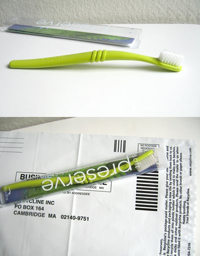 Recycline decided to provide its customers with a convenient and timely way to replace their toothbrushes- kinda like Netflix, where once you're done with one, they send you another (only they will send you a new one- not a used one, silly). When you return your used up toothbrush (you should change it every three months) they recycle them into plastic lumber (faux wood!!) which they use to make park benches, house decks, and other outdoor products. This recycling system obviously can't be that profitable for them, but they know that. They feel good about the responsibility it takes to both use recycled materials and to provide a means for easy recycling. Visit their website for more info and to purchase. The Preserve toothbrushes are also available at select Target stores. Click here for a store location near you.
bird shears
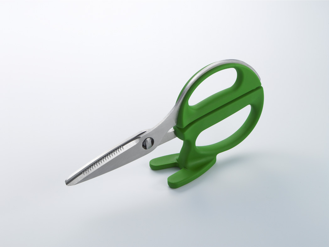
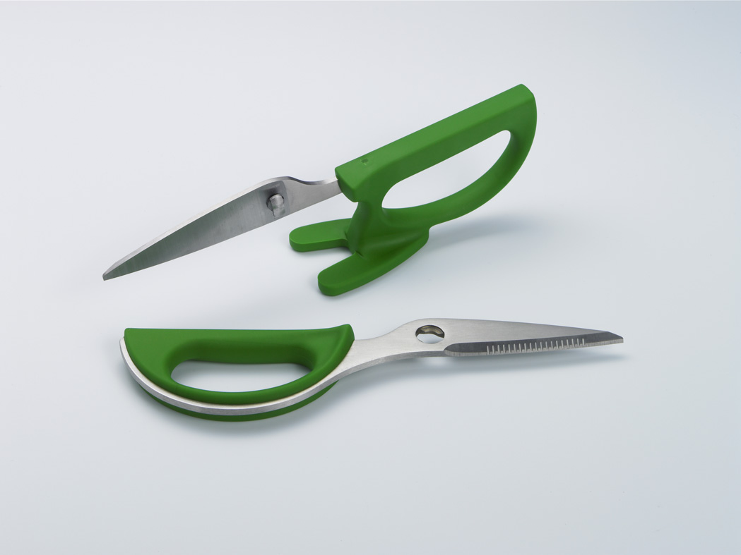 As spotted in City Magazine, I love these shears that look like a bird! Designed by Hiroshi Kahimoto, it won an IF product design award for 2006. Love the green, so fun!!
Thursday, April 27, 2006
moby was a consumer
 well.. I guess I'm continuing the blue theme this week...
This t-shirt by Jim Slatton cracks me up- and scarily (is that a word?) is so fitting for me. Thanks to my friend Laura W. who sent me the link and said it reminded her of me. I don't know if that's good or bad, he he... (thanks Laura!) Get yours here.
Wednesday, April 26, 2006
lego
 This actually could'a been a Blue Monday post, but alas, it's wednesday. so...
anyhoo- i just have no words for this image. I am in awe of this that I recently saw on MoCo Loco. This "marina City" is all made of LEGOS! Legos were a HUGE part of my childhood. I would play for hours making these gigantic space ships, and this totally brings me back. These pieces by Michael Labelle are amazing. just amazing. The colors... can i shrink down and live there too? Funny how something so little and simple as a lego block and add up to so much!
Tuesday, April 25, 2006
happymundane.com
Conducting a little blog maintenance- my apologies to anyone who tried going to happymundane.com and it not working- should have that all cleared up in the next day or so- you can also access happymundane via http://happymundane.blogspot.com
book review: Patterns

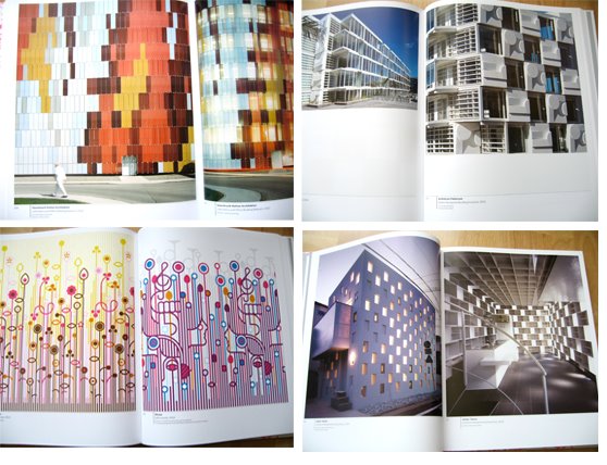 Em posted today at Itsknotwood about the incredible Heinrich Weid, that was featured in this book I recently got called Patterns in Design, Art and Architecture. It's written by Petra Schmidt, Annette Tietenberg, and Ralf Wolheim. I first read about it in Wallpaper, but it wasn't until a friend who had recently come back from a trip from Paris, was mentioning it again to me, that I decided to check it out. It's an amazing visual reference of pattern that has recently made a resurgence in design within the past few years. The idea of "ornament" is fascinating and this book shows tons of great examples, and in all aspects of design. The fluorescent cover alone sold me. A must have for any design junkie! Click on the link below to get it now or to see more pages!
Monday, April 24, 2006
blue monday: caleb siemon
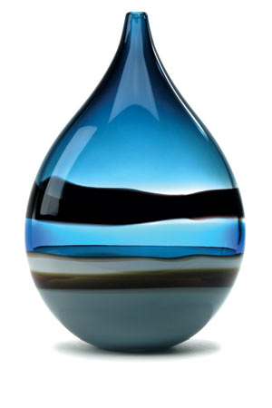
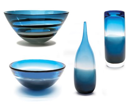 Caleb Siemon is a local Orance County artist, who does these amazing hand blown glass pieces that are sold at high end boutiques throughout the country. In LA, you can find his stuff at OK, or if you're in the OC, they're at the always lovely Artisance. I've had the pleasure of actully handling these pieces for a shoot we did for Poplife, and I must tell you they are even more stunning in person. They aren't cheap, but they are truly works of art, and definitely a sound investment. He has many other colorways, but of course, since it's a Blue monday, I give you a few pretty blue ones from the 2006 collection.... see and read more of his work here.
Subscribe to:
Posts (Atom)

 Posts
Posts


