Thursday, May 15, 2008

Martha Stewart ad campaign : Curator, Collector, Naturalist?

Have you seen the recent Martha Stewart ad campaign for her home furnishings? I was immediately attracted to "the Curator", probably because of the rich colors. There's also "the Collector" and "the Naturalist". I think I'm sort of a mix between all three. I'd love the happy bright clean feel of "the Naturalist" for my imaginary vacation home by the beach. Which one are you? Check them out here.

Tuesday, May 13, 2008

Whim by Cynthia Rowley at Target

So I've been eagerly anticipating the arrival of the new Whim by Cynthia Rowley at Target. I was looking forward to see what fun things she was going to bring to outdoor accessories. Well, it finally showed up at my local Target, and if you haven't already seen it, here's my take:
The first thing that caught my eye was the plaid. Plaid is something that a lot of people either hate or love. I'm not a hater. I love the fun colors and think it would be perfect for a summer shin-dig. Love the napkins and bucket/tub thing.
I'm a little on the fence regarding the whole rattan pattern print (it seems sort of... "done"... like.. by a lot of other people... um... two years ago?) but at the same time, it's such a classic pattern that works well for patios and summer in general. The green colorway is really neon-ish, and I wasn't really feelin' it. However, the pink colorway with green trim looked pretty good. They also had some clear plastic tumblers with the pattern that could be fun. I could picture them holding some yummy refreshing lemonade...
They also had some clear-with-white rattan pattern placemats that I could see useful for maybe some other projects... I liked the rope pattern design on the sarong, which I thought could act as a nice table runner too. The whole beach accessory area was really fun. Then I noticed that they had these total Fred Ice Kabob knock offs- which I thought was kind of weird. I wonder why they didn't just use the original ones, since they're already kinda affordable... (unless maybe they struck up a deal did some sort of private label version or something... anyways- who knows...) But they're like $3... UPDATE: Thanks to HM reader technicolorsarah for letting me know- Fred was totally ripped off. that's sooo sad.

Finally the only thing I actually purchased was the infamous garden hose. The Pink version has been getting a ton of press, and... - it's really hot pink. Looks super cute. My only gripe about it is that it's actually a lot thinner/smaller than I had thought. If you have a small space that you need watering, this should be fine, but the actual width/diameter of the hose is not very large. I actually got the bright cyan blue version (naturally, hehe)- They're mixed in with the rest of the pool toys and inflatables, etc... so don't look for them in the garden section. I've been to three Targets around here (don't ask) in the past week and noticed that they have them stocked in ratios of three to one. (three blue to one pink) so if you want a pink one- you better go grab it.

Have any of you been by to see it? Did you get anything? What as your take?

Monday, May 12, 2008

Wood Work by Karen Ryan


Dezeen recently featured the work of Karen Ryan. I am so in love with the wood/fluorescent plexi mix. It feels so graphic and modern. Reminds me of a lot of graphics going on right now, but in 3D. Her other work is really interesting as well- Check out more of the "wood work" pieces here and her other projects at Karen Ryan's site (note: her site takes a while to load...)

ed emberley products

OMG. Remember my love for Ed Emberley (here and here)? Over at Print & Pattern, Bowie style posted that Japanese company Hightide has licensed Ed Emberley stationery products! I hope they'll make their way over here... Check out more here!

Friday, May 09, 2008

Aviva Stanoff video

A while back I posted the goregous pillows of Aviva Stanoff. Point Click Home has a great video that interviews her about her process of pressing velvet- amazing! click here to see it.

Wednesday, May 07, 2008

Sea Life Dinner Plates by Thomas Paul


Argh- so busy. But just wanted to get these up because they are sooo cool. These Sea Life Plates by Thomas Paul are amazing and not sure why, but I am so drawn to the Octopus and horseshoe crab! Available here.

Monday, May 05, 2008

Trina Turk Residential Store

Over the weekend, I had the chance to check out the brand new Trina Turk Residential store. (Kind of a funny name isn't it? Residential...) Anyway, as you'd expect, it's gorgeous. Her fabulous prints are on all sorts of luscious cushions, and there's a great collection of vintage pieces and wonderful pottery from Atwater Pottery. Also, she has a line of candles that smell so good. My favorite was Beach and Desert. (I picked up a Desert one) They also carry a bunch of Missoni Towels (um... I may have been really bad and splurged a little there too...) The colors and prints are amazing and I wanted everything in there. Next time you get a chance to visit Palm Springs, definitely don't miss it! So much color inspiration. See more here.

blue munday: Krislyn Design


A couple weeks ago, I posted on AT:LA about the new Fred Segal Green store opening in Santa Monica. One of the comments provided a link to Krislyn Design Studio, an amazing floral design store in LA. Check out their beautiful work at their site. All of their work is really stunning...
(images from Krislyn Design Studio)

Saturday, May 03, 2008

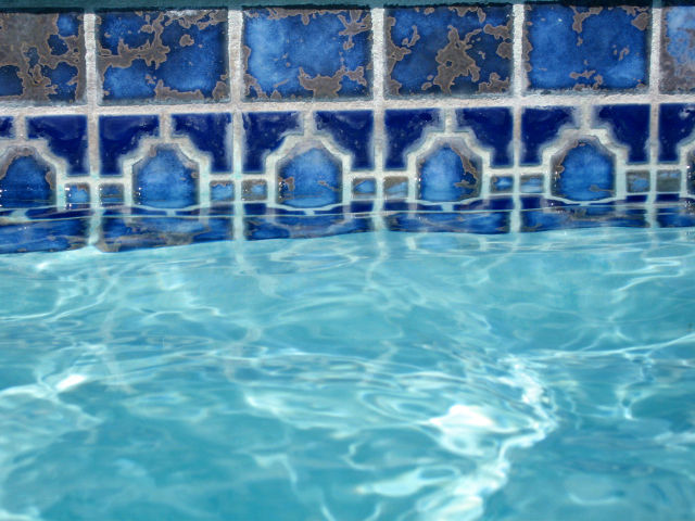
mundane aesthetic: pool tile

Friday, May 02, 2008

cinder block planters and pretty vases

Last weekend was the big Garden Show at South Coast Plaza, here in OC. I always enjoying going to it, (although parking is horrendous.) Anyway, there are always so many beautiful plants on display and for sale, and it's fun to see the competition exhibits that are done by many local landscape architects and designers. This year two things really caught my eye. First, this really simple idea for using cinder blocks as planters. I know this isn't exactly a new idea, but it just looked fun and kinda modern, and sooo easy to do. Then was this booth from this local floral designer, The Juicy Leaf. He layers sand and rocks in clear vases and puts succulents in them. The prices were kinda high but they sure were purdy. It seems like it wouldn't be too hard for a DIY version (although- I'm not sure how the roots of the plant would get past the rocks... maybe there's a hidden container or chamber of dirt inside. Anyway, I might need to try something like this for a table centerpiece this summer...

Eyelet covered rocks

I don't know why but I find these incredibly beautiful. via Craftzine.

Friday Video break: What u do 2 me makes me runaway

Boomkat
Boomkat - What You Do To Me

Thursday, May 01, 2008

More of those colors....

So the colorstory I've been obsessing over has now morphed into another colorstory, that is a bit more... Italian ice cream-ish? Maybe because it's been so warm around here lately... This coolness street art by artist Cody Hudson - who's blog is here, and the cover of a recent Elle Deco Japan.

Animal silo dividers

In keeping with the book theme, I love these! I suppose you could easily DIY your own, but definitely a fun idea! From here, via Mocoloco.

Wednesday, April 30, 2008

kraft covered books

I've blogged about "white on white" books awhile back (yikes! that was a year ago?!), and in the April 2008 Domino (the one with Drew Barrymore on the cover), I noticed this little tidbit from the interview with India Hicks. She covered books in kraft paper, inspired by how her dad would do red leather bound. There's something about this that really appeals to me. Maybe it's the nostalgia of grade school, where you'd cover your textbooks with grocery bags (did you all do that?) I love how she added little tags/labels on the spines.
(image from Domino)

Tuesday, April 29, 2008

Cuckoo mystery...

So... in a recent PBTeen catalog, there was this image. Naturally, this is just a prop as there is no listing for it. (Of course, I am always noticing those background things usually more-so than the product they're actually selling... sigh) Anyhoo- where did this cute & cool cuckoo clock come from? I love how it's so modern, yet still somewhat traditional... I likey. Anyone recognize it?

Monday, April 28, 2008

mundane aesthetic: new

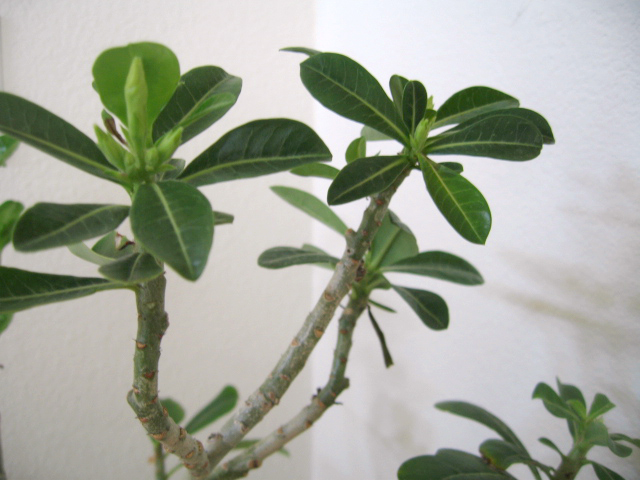
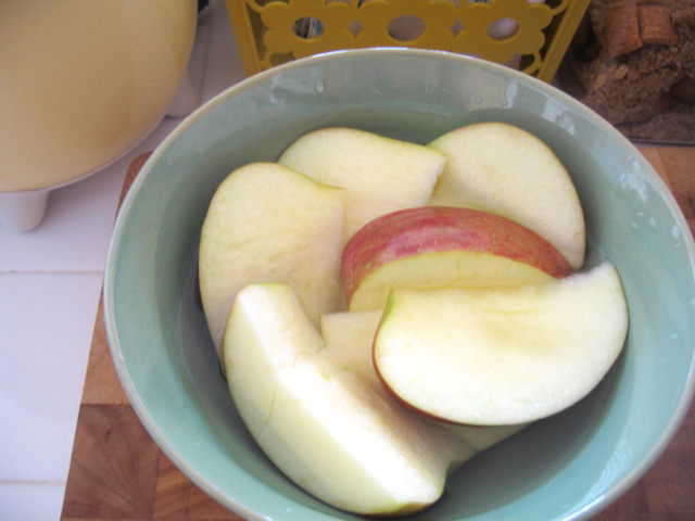
new growth!new artwork!new apples, yummy...

Blue Munday: Cloud Salt and Pepper Shakers

These are so cool! These Cloud Salt and Pepper Shakers are by product designer Anderson Horta, from Brazil. I think they're only conceptual, but they sooo need to be made into production! They're made of rubber, so you can squeeze out if the salt gets solidified. Check out more of his designs on his blog. (via Designspotter)

Friday, April 25, 2008

Colorstory?

So I'm still totally being attracted to this whole weird colorstory that I've been seeing so much of lately. I think it's the whole combination of light pink mixed with yellow and grey with a little muted light blue/seafoam that is really getting to me. In the April 2008 Elle Decoration, they had it as their color scheme for the month... ...Love it. I'm trying to call it something, any ideas?

Neon Birds by Tyler Clark Burke

Check out these awesome neon laser cut birds by artist Tyler Clark Burke! She also has them in a mirror version. More info here and here. (thanks Neil for the tip!)

Thursday, April 24, 2008

U/O SP 2008