 Love this. If only I could have the contents super-sized as well...(aka $$$)
Tuesday, October 17, 2006
Can I have fries with that shake?
Love this. If only I could have the contents super-sized as well...(aka $$$)


Monday, October 16, 2006

Thursday, October 12, 2006
black and white TV
 Posting will be light the next couple of days. I'm going to be here, there, and everywhere and back again, so I might not be by my computer as much (is that a good thing?) I'll be back in full swing this weekend, and should have an interesting report (ooh.. such mystery...) here's a vague hint: I leave you with the new Crate&Barrel TV commercials. "if you have something important to say... say it in black & white" here's the link.
Ok.. now that i think about it. that clue kinda sucks and doesn't have a whole lot to do with what i'm doing or where i'm going...except for the TV part... (huh?) um...
so... sorry, you'll just have to wait, hehe...
In the meantime, please peruse the archives (to the right) to see all the other happy mundane moments... and please comment! I'd love to hear from you!
oh- and before i forget, Holly at Decor8 gave me the tip for all you Bostonians that they just opened the first US Marimekko store! here's a link to her post-
Monday, October 09, 2006
Blue Monday: iconic Blue bathroom
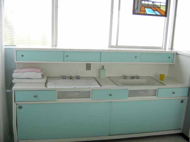 Its monday. And for many people here in the States, its also Columbus Day, therefore a holiday. But alas, not for me, as I have to work. Sad. But let's look at something pretty. Here is a humble, yet fabulous blue bathroom. Now, where is this bathroom? Well, if you can make out the stained-glass artwork, hanging above the sink on the right side, you might be able to figure out that this bathroom is actually part of the iconic modernist classic, Case Study House #22. Two weekends ago, I was able to go on a house tour, put on by CaBoom. It was amazing to see one of the world's most photographed and recognizable houses up close and personal. It has stayed with the original owner's family, and the wife, Mrs. Stahl was actually there, answering questions and giving trivia. I love the little sliding cabinet doors that sit above the sinks, as well as below. I want.
Friday, October 06, 2006
graphic tableware

Just saw these on Print&Pattern, Bowiestyle found these incredible graphic tableware by Snowden Flood- LOVE the barb wire cup!!!
Thursday, October 05, 2006
mundane aesthetic: happy moments
two happy mundane moments today:
a clean organized cupboard
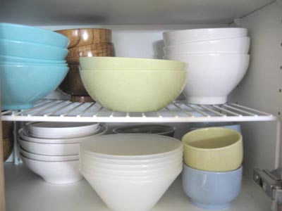
my framed picture of a postcard of trees by Lisa, from her last show...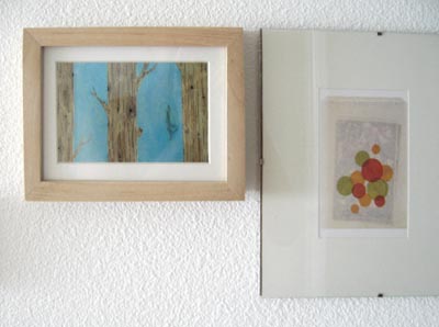
a clean organized cupboard
my framed picture of a postcard of trees by Lisa, from her last show...
Wednesday, October 04, 2006
Magnetic Paper and Jasper Goodall
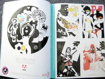 Picked up the über cool Clear magazine, and the ever sexy and stylistic Jasper Goodall illustrations immediately caught my eye. Apparently, it was for an ad for Adobe. I thought they were just post cards, but then I find out- it's printed on magnetic paper?! how cool is that? Must re-arrange refridgerator to accomodate! check it out if you're by a newstand...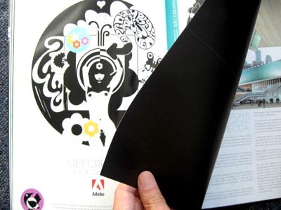
Tuesday, October 03, 2006
Roxy Sheets
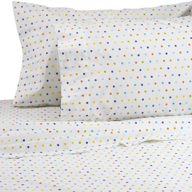
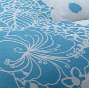 Summer is technically over, and sadly I never officially had a "vacation", which is just wrong isn't it? So this morning I dream of coastal waves and exotic locations. I've been very tired lately, as a result of a recent voluntary sale to slavery for a big account project. Alas, I forgot yesterday's Blue Monday post, so today will be Blue Tuesday. My downstairs guest bedroom has always been my, sorta, "getaway" room. I went for a slightly tropical feel, as it leads into my patio that has a nice fountain. The couch actually folds out into a bed, but I've been meaning to get a proper sheet set for it. This might be a good option... except that the comforter doesn't come in a full size. But I like the pretty swirly hibiscus pattern, and the co-ordinating polka dot sheets are fun. (I could do without the gingham check stripe detail though...) Oh well... off to dream...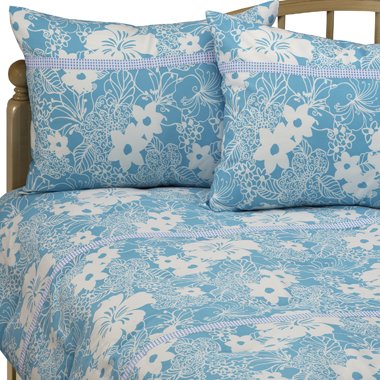
Monday, October 02, 2006
Small Space Big Style
 I recently got the latest issue of ReadyMade, and had to point out my AT co-editor and pal Gregory Han's super styling pad he shares with his girlfriend Emily. It is the lead piece in their "small spaces" issue. If it looks familiar to you, that's because it was first featured in AT's recent Smallest Coolest contest. Gregory and Emily's place is just downright super coolness. Despite it's small size, they've been able to keep functionality, without sacrificing style: infusing it with bright happy colors and fun personality.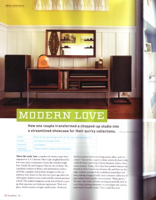
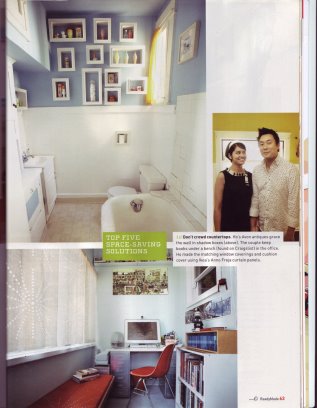 A definite inspiration for anyone, no matter what size your place is. Gregory and Emily were recently filmed for an upcoming episode of HGTV's Small Space Big Style, which may (or may not) co-incide with some potentially entertaining news that involves myself, which I will reveal at a later date...(hm...?) in the meantime, go check out Gregory and Emily's place in the Oct/Nov '06 Readymade.
Friday, September 29, 2006
Fluxus: InverseFunction
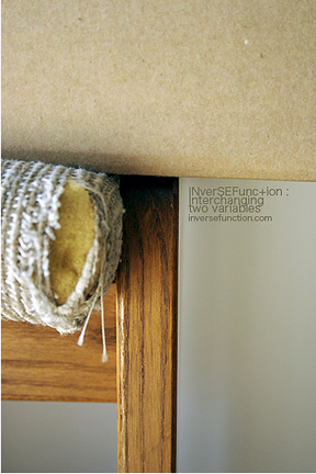
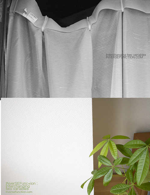
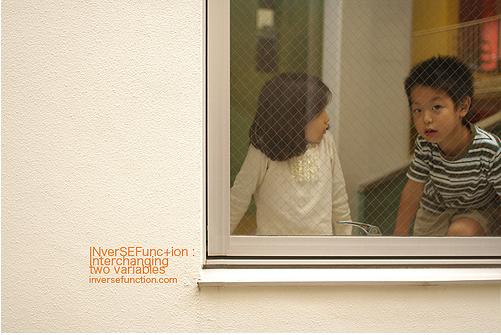 I recently came across the work of Fluxus, and her site InverseFunction. (I don't remember exactly how I came across it, so I apologize for not giving proper credit) but anyway, I immediately fell in love with her amazing photography. She truly is happy mundane. Living in the visual craziness that can be Japan, she manages to focus her eye on simple beauty and captures it in the most stunning ways. I contacted her and she gave me a little insight. She's very into video art and photography, and trying to become a full-time atists. She says "I'm very much into FLUXUS, avante garde, and conceptual art and designs, and my aim is to integrate them into my work." Check out her flickr site, and also her other site Fluxmode. Between the two sites, there is just too much visual overload of beautiful imagery- you'll be stuck there for hours just admiring them! Have a great weekend!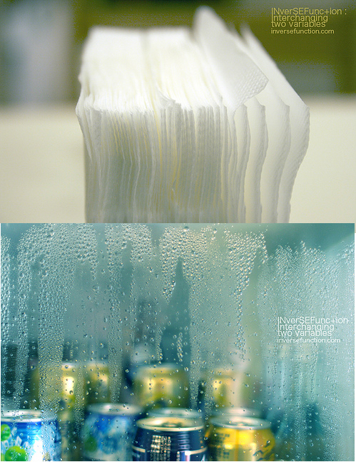
Thursday, September 28, 2006
CANstruction
 I did a post about this on AT, but I thought I should post it here too. I was flipping through the newspaper today, and came across this really amusing article. There's a big nationwide circuit competition called CANstruction, where people make these big sculptures out of cans. It was started in 1992 by the Society for Design Administration, and has taken place in more than 70 cities across the US and Canada. The real motive for this competition is to see how many cans they can get delivered to the food bank. It's estimated that a donation of 20,000 t 40,000 cans could provide about 30,000 meals. Teams use as many as 1000 to 5000 cans per structure, at a maximum of 10x 8x10 feet. The local architecture and design community in which the travelling comeptition takes place are given a call for entries. This time it's going to take place in Los Angeles. For more info, go to their website, and you can see some fun pics of other CANstructed creations!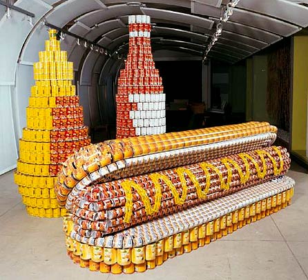
Wednesday, September 27, 2006
more honey
I recently post about the honeycomb/hexagonal trend that I keep seeing everywhere. Here are a few more sightings: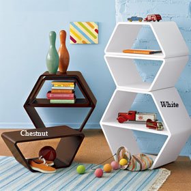 These fun honeycomb nesting tables at the Company Store...
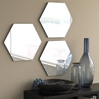 and I love these mirror tiles. I can totally imagine a large organic pattern being done with these on a wall. And finally these totally Hollywood Regency/glamour style print sheets by Dwell.
 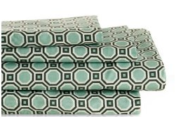 Have any of you spotted more?
 These fun honeycomb nesting tables at the Company Store...
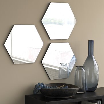 and I love these mirror tiles. I can totally imagine a large organic pattern being done with these on a wall. And finally these totally Hollywood Regency/glamour style print sheets by Dwell.
 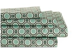 Have any of you spotted more?
Tuesday, September 26, 2006
Laundry Rug
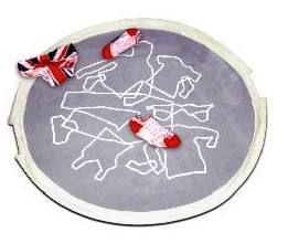 I must confess. As much as I love clean modern minimal design, I am not always the "neatest" person. And to be perfectly honest, I can be quite the lazy slob. Especially when it comes to laundry and dirty clothes. Despite the fact that I have a generous size hamper. I always somehow manage to miss it... and strangely they end up tossed and piled on the floor. Funny how that keeps happening... hm... hehe.. Anyways, I think that I really need to get this: The Laundry Rug is a brilliant floor pad that is designed for throwing your clothes on top of. You then pull the side handles and it turns into a bag. Yeah.... I sooooo need this. (via Uncrate)
Monday, September 25, 2006
Blue Monday: post it lamp and stuff
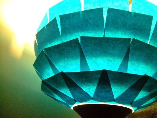 I've posted about the wonderful Post-it before, but check out this crafty little number! Make flickr member Neonarcade customized an IKEA lamp with post-its- (found via here via here)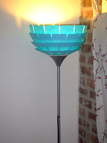
Friday, September 22, 2006
Colorama- Jay McCarroll
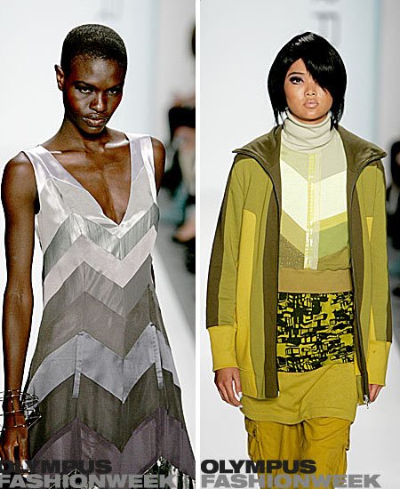
 T.G.I.F!! (that's all I gotta say!) Anyway, to celebrate, let's look at some lovely colors shall we? When the first season of Project Runway ended, I was really impressed by Jay McCarroll's collection. It was fun, original, and full of great color. Well,at the recent Olympus Fashion Week, Jay finally launched his first full collection- and I gotta say, he did not disappoint! Look at the amazing colors and fun mod styling. Definitely looking forward to seeing more from Jay.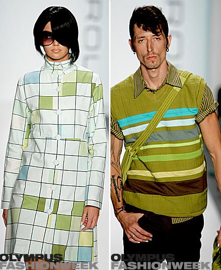

Thursday, September 21, 2006
Tape Ball
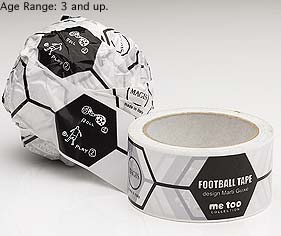 Ok, there's just something totally genius about this...
Every time I finish painting a wall or something, a big tape ball to kick around is just a traditional part of the whole painting process. It's always fun to see how big you can make it too... Which reminds me of Pee Wee's Playhouse, where Pee Wee would bring out his big foil ball... (sigh)... good times..
Wednesday, September 20, 2006
Real Simple Food
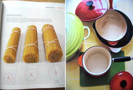
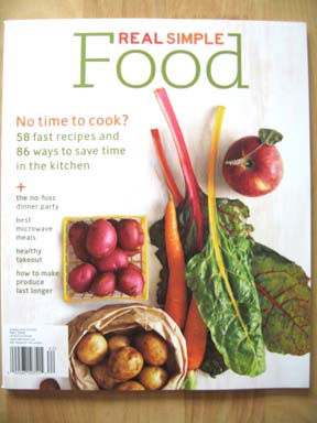 I think I've mentioned before, I would not say I'm very adept in the culinary department. However, I do like to eat, and I love the "concept" of cooking, I love watching the act of cooking, and I love kitchen gadgets. It's just the actual act of cooking that I seem to have a problem practicing. Well, I just received this new special issue of Real Simple magazine, called Food (or Real Simple Food). Besides the goregous photography, I found there's tons of good info for a fledgling gourmet as myself. For example: there's a great page that shows a diagram of how much pasta to pull out for one person, two people, etc.. (I always have a hard time with that!)
  There's also a great piece that shows "Fake it, Don't make It" recipes, where you use store-bought ingredients, and combine them to make people think its homemade. Kinda like that show on HGTV, "Semi-homemade..."( ...though that host kind of annoys me. She always matches her kitchen to her outfit. Weird.) But what I really loved was they give you a list of "healthier choices" of what to order from typical fast-food chains. As much as I try to eat better, when lunch time comes around, sometimes you just can't beat fast food.
 My only complaint on the issue was a section by four writers that pay tribute to "my most memorable meal..." I thought it was kind of strange that they put the writer as the main large picture, instead of the food. Frankly, I would have rather looked at a large yummy picture of food than the writers themselves. Anyway, a pretty neat issue. Check it out if you're by a newstand...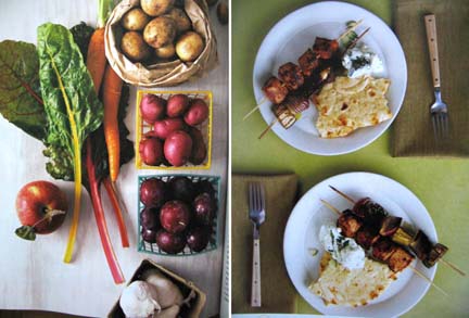
Tuesday, September 19, 2006
Farm Life
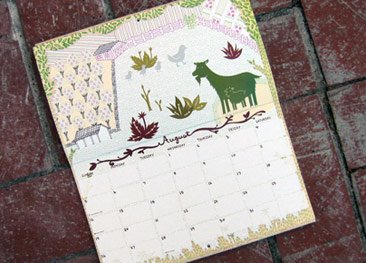
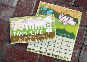 Even though I live in suburbia, the city of Irvine still has some farm land that hasn't been filled with insta-grow housing. There's something really charming about driving down the road and seeing a small slice of the "simple life". For those who want to add a little country in their city-life, there's this great new calendar by Jill Bliss and Salee Oh. Entitled, "Farm life", it features farm seasons, plants, animals, and more! It's also printed with soy inks and on recycled paper too. They only made 1500, so get your copy quick!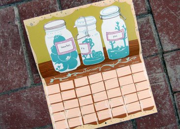
Monday, September 18, 2006
Blue Monday: Method Tub and Tile
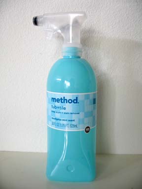 Happy Monday (as much of an oxymoron as that is...) I bring to you the beauty that is the bottle of this soap scum + stain remover from the ever clever toxin free peeps at Method. The baby blue color is so pretty, and I like the eucalyptus mint scent. I haven't used it yet though, but I do use their flushable bathroom wipes. Do any of you use this? Thumbs up? thumbs down?
Saturday, September 16, 2006
gray is the new black
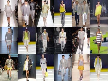 So, for those of you that are sick of my gray obsession... i'm sorry to say, it's only gotten worse. And after a look at what's coming down the runways at NY fashion week, gray is definitely coming your way, and maybe here to stay?... (at least until the end of Spring 2007). Check out just a small sampling of all the gray/yellow coloway combinations that labels such as Burberry, Calvin Klein, DKNY, Paul Smith, and Marc Jacobs (there are other designers shown in this mix, but you get the idea... hooray for gray!) It will be interesting to see how this will translate into home decor. Anyone have any thoughts? ideas? wishes?
Friday, September 15, 2006
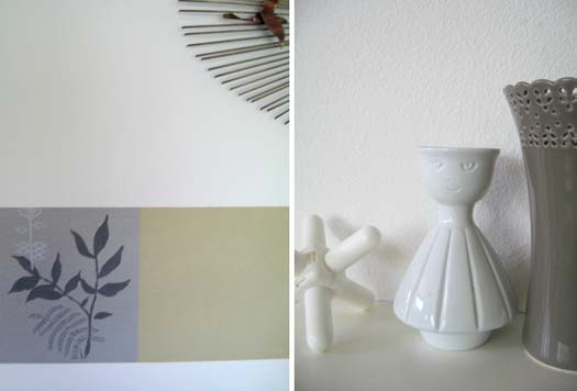
mundane aesthetic: gray house
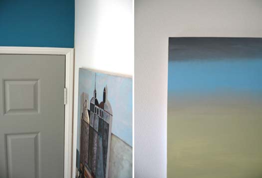 It's a very gray and overcast morning today. my whole house is awashed in a very gray mood and light. (Not that there's anything wrong with that!)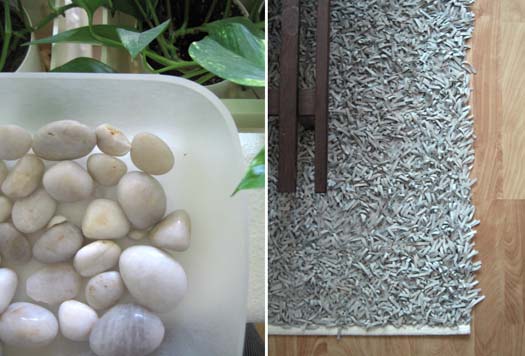
Wednesday, September 13, 2006
Alexander Girard at House Industries
 Ok, sorry, I got so swamped that I wasn't able to post until now! First, this is going to be a graphic design-geek focused post, but one I think most design-luvers can appreciate. I just got an e-mail announcing the new "Luxury" collection for House Industries. It's a cool collection of "money" inspired fonts, but more importantly, while clickin on their site, it mentions that they are working on a collection of fonts based off of Alexander Girard! OMG! that's going to be amazing! Much like their cool Neutra font family they released a few years ago, an Alexander Girard font will hopefully be equally cool! I can't wait!! Although, now that I think about it, what would a "Girard" font look like? So... until they officially release it, lets take a gander at classic AG genius-ness. I took these from the book "Alexander Girard Designs for Herman Miller" by Schiffer Books. It's an oldy, but classic goody! Here are a few type-driven designs he did that may give us a clue....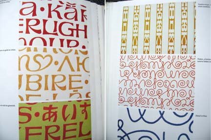
 I'm so glad that both Vitra and Maximo designs are re-releasing his stuff...anyways- a little AG hit is always nice any time of the day....here's a few more of my favorite Alexander Girard designs...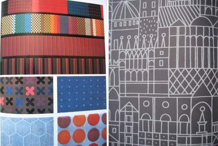
 pick up a copy of the book (a must have) here:
Subscribe to:
Posts (Atom)

 Posts
Posts


