Wednesday, July 26, 2006

gray matter

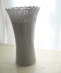
I recently picked up this great gray ceramic "eyelette" vase from Anthropologie. Much like my over obsession with pillows, I have waaaay too many vases, and fully admit to having a problem. However, in true addict form, I could not resist the beauty of the gray (grey?).
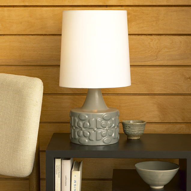
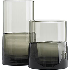
I've been seeing a lot gray lately- especially in ceramics- and I love it. Its a nice neutral and alternative to stark white or black, and feels fresher than brown or tan. In this month's House&Garden, they featured this great room that showed a mantle full of gray vases- I also love this lamp from West elm. And finally, while not exactly "gray", I'm also loving these smoked/"double dipped" glass tumblers at Pier1. Is anyone else feelin' gray? (in a good way)
Tuesday, July 25, 2006

Old Navy wrapping paper

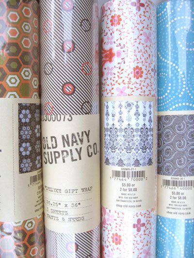
Who knew that Old Navy had wrapping paper? and pretty cool ones at that. however, they seem to be on sale/clearance already (and I didn't even know they were out there!) Anyways- these are the four styles I picked up- Maybe they still have some at an Old Navy near you? They're not on their website, but has anyone else see these in store?

strawberry lemonade

It's too hot here. Strawberry lemonade to the rescue...

Monday, July 24, 2006

Mouthwash is cool

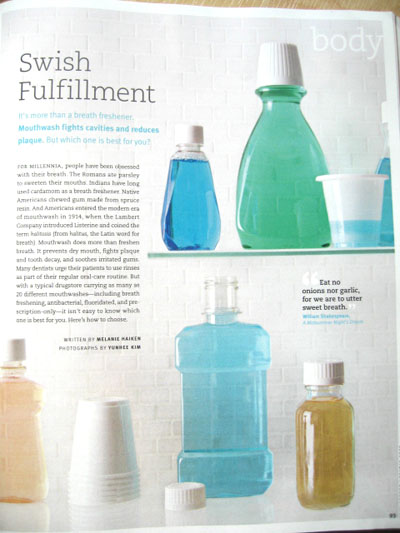
It's blue monday, and with the heatwave that is over us, I was relieved to look at mundane-ly beautiful images of cool and refreshing mouthwash. Those clever folks at Real Simple did it again with this great editorial story. Amazing images by Yunhee Kim. I love the containers that are stripped of logos and type, revealing the soothing colors of the liquid. If I could get a mouthwash bottle that was devoid of graphics, I wouldn't have had to go on my mission awhile ago, however, I am still happy with my current container.. anyways- check out the August issue- I thought the article was really informative...

Friday, July 21, 2006

Tyke and Jon's place

Just wanted to highlight an amazing house tour/slideshow I posted up on Apartmenttherapy:LA this afternoon. Tyke and Jon (not me, a different one) have an amazing home in Topanga Canyon, CA. I was introduced to them from Tracy, who we featured in a previous issue of Poplife. I love the mix of old and new, warm colors, and excellent balance of comfy and coolness. Check it out at this link here. Unfortunately comments were disabled on the post, but feel free to gush here!

Thursday, July 20, 2006

Deanne Cheuk at Target

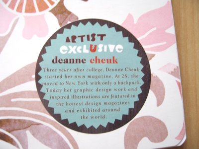
Ok- I promise this is the last gushing of Target's Independent Studies line. So please humour me with my last piece. I bought this notebook, that was in their back-to-school supplies section. They've extended the whole "bronze age" collection into stationery and office stuff, like message boards for lockers (which actually could be great in your kitchen, or by your front door, etc..) folder, desk accessories, and more. I loved the watercolor imagery. But what I especially appreciated was that on the front cover, they actually had a big sticker that credited Deanne Cheuk, and gave a short bio on her. Props to Target for highlighting the talent, and also inspiring other would-be artists in pursuing their artistic dreams.

Wednesday, July 19, 2006

for the birds

I love these bird feeders now available at Sprout Home. The colors are gorgeous and they remind me of those ones that are made out of gourds. I actually have a real gourd one that I found at garage sale awhile back. This dear old lady actually hand painted these butterflies and dragonflies on them.. but.... sorry dear old lady- I really want to just paint over it and make it a solid color (I know, I'm terrible... I steal candy from children too...) I'm hoping to finish it sometime during this summer, to accompany the feeder/light thing I already have on my tree. Speaking of fabulous bird feeders, there's also these sexy things from good ol' J.A. and also this Vessel Architectural Pottery one from Velocity... do any of you guys have bird feeders too?

Tuesday, July 18, 2006

Face to Face

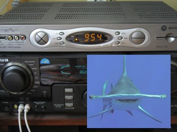
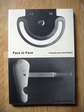
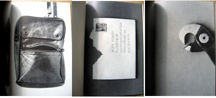
Today, while watching my morning tv, I started staring at the cable box, and noticed that it kind of reminded me of a face... like that of a hammerhead shark. It was kind of funny, all silver and staring back and me. It totally reminded me of this book, Face to Face, by Francois and Jean Robert. This book is an oldy but goody, having first been published 10 years ago, in 1996. I think I've had it since then, but its one of those few books that I find myself really going back to looking at frequently. The book is filled with these fantastic photographs of everyday objects. There is no manipulation to these. Just good old fashioned cropping, straightforward photographs, and the title "face to face." It's funny, I bet, if there wasn't the mention of the word "face"- I probably would look right past these things, yet, with that word stuck in my head, I automatically look for the face. It suddenly gives everything around you a personality. It really shows how our perception of the world can change just by the way you see it. What do you see?

Monday, July 17, 2006

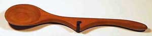
Lazy Spoons

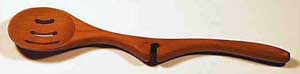
I love these wooden "Lazy" spoons that Swissmiss found- I love how a simple cut out notch makes this everyday untensil even more efficient.

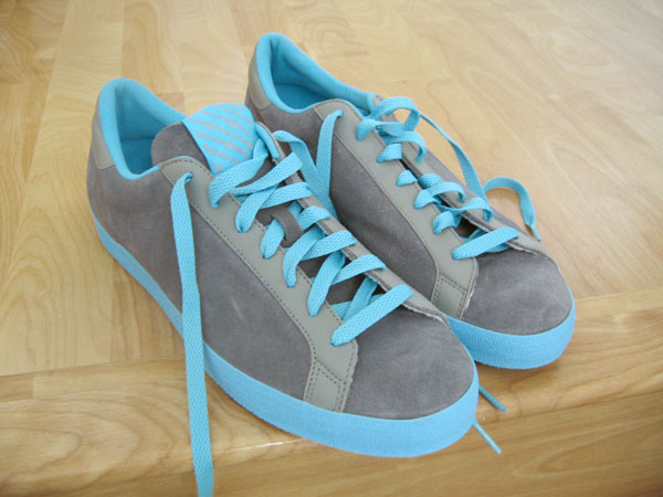
Blue Monday: new kicks

First, I just want to say, I'm not generally a sneaker freak. However....I gots me sum new kicks!! Earlier this year, I was obsessed with getting this pair of aqua/grey Diesel shoes. Something about that colorway totally stuck with me, and I had to have it. Sadly, every Diesel store I went to didn't have my size. And so, I was forced to carry on life, without aqua/grey shoes. Then, last month, I came upon a sale at the Oki-Ni site, and saw these lovely Rod Laver Vintage Adidas, and they were in the same aqua/grey colorway! I had a second chance for shoe-colorway romance, and immediately ordered them. Mild catastrophe later (I screwed up my UK sizing, and they were a teensy bit too small, but ended up exchanging them - braving the drama that is the US Post Office) and now I got my new kicks! aren't they purdy?

Friday, July 14, 2006

Anagrams

So fellow blog friend Typefiend, just sent me this hilliously silly link that will automatically generate anagarams for you. For all of you that have blocked out English 101 all together, (like me,) an "anagram" is : a word or phrase formed by reordering the letters of another word or phrase. So, "HAPPY MUNDANE", can also be: A HANDYMEN PUP, or PANDA HEN MY UP, or NAMED HAPPY UN, or DAME HYPE PUN- LOL, (sigh)... fun for hours! yeeah..... is friday over yet?

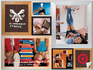
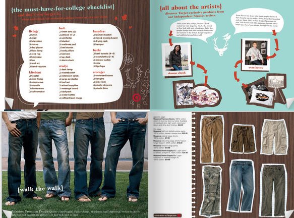
Target: Independent Studies part 2

So, just like the Spring 06 home catalog post awhile back, Target's Independent Studies collection that I mentioned earlier, now has it's own catalog! I took some pictures of it, and will post it as an update (I left my camera cord at the office), but it came with the newspaper, and they also have it online as well- Very Urban Outfitters-esque- but still cool, none the less- Love the woodgrain, cut+paste vibe- and also love how they mixed in all the everyday products, like peanut butter, or detergents. See it all here!-

Thursday, July 13, 2006

Stamps in!!

I got my stamps in that I mentioned about awhile back- They actually came within the next week, but I just haven't gotten around to posting it- They are sooo cool! I'm so excited. I wouldn't use them for sending bills or normal correspondence, but for special letters or packages, these are super sweet!

Wednesday, July 12, 2006

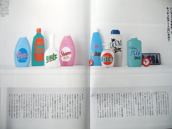
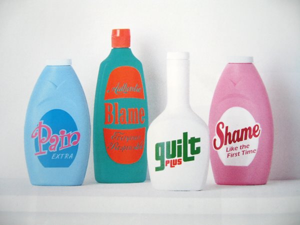
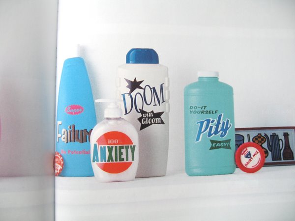
Depressing bottles

On my last visit to the japanese bookstore, I picked up a copy of the Japanese June 06 Elle Deco- I came across this funny spread of these bottles that have these hillariously depressing "logos" on them. I love the contrast between the happy colored plastic bottles and fun style of graphics, with the more cynical words and phrases juxtaposed. I don't know what these are, or where, or why- (does anyone read japanese?) but I know it has something to do with this shop in Japan called "wonder-travelling.com"- Great stuff on that site too (as to be expected...- oh, someone really needs to send me to Japan soon...)
UPDATE: Thanks to HM reader S and The kind folks at Gallery Revisited for letting us know this work is by Neil Wax. They are on exhibit at The Gallery Revisited in Los Angeles- Thanks for the info!!

Tuesday, July 11, 2006

Someone's trying to tell me something...

Ever get the feeling that the cosmic design universe is trying to tell you something? Part of my job(s) is picking up on trends, checking out the "market", feeling "the pulse", etc... and I think most creative types do that subconsciously by nature. However, this is something different. I don't necessarily think this is a "trend", as clusters of circles is nothing new. It was more like a "why am I being drawn to these things?" kind of thing.First, it really started with a trip to Pier 1, where I spotted this nice circle clustered pillow. I really love the textures and the graphic element of the clustered different sized circles. Then, I happened into Anthropologie, and immediately noticed this great wall display of these dried pods- which reminded me of classic C.Jere metal sculptures of the 60's and 70's- and more recently the ones that Wingard has-And speaking of Anthropologie, Walmart has this sorta Anthropologie-esque bed set that also is a patchwork cluster of circles (now on clearance!)...I'm not really sure if this is supposed to mean I'm supposed to do something with clusters of circles, but I can't stop thinking about them. Are any of you guys stangely being drawn to some design theme too? (please let me know I'm not the only one!)

Monday, July 10, 2006

blue monday: mint water

It was quite hot this weekend, but I stayed hydrated and kept my cool with my metromint water. I have to admit, I was a little weirded out by the thought of peppermint water. I don't know why. I'm not a big fan of lightly flavored waters. I don't like the "fruit water", because it reminds me of drinking water out of the same cup after having a glass of orange juice. I prefer the vitamin water instead, because it...actually tastes like something. But finally my curiousty got the best of me, and boy, I was pleasantly surprised. It's so refreshing! Do any of you like it too?
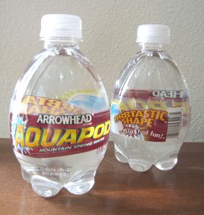
Speaking of water, this weekend at the grocery store, I also found these super "Aquapod" water bottles by Arrowhead. How cool is this? I love the shape!- and the fact that they say "orbtastic" on it. I'm such a sucker for anything "orb"-like. I would love to see a whole row of these (without the label) filled with a blue sports drink or something... Here is a link to a coupon you can print out if you buy two packs.

Friday, July 07, 2006

butterflies

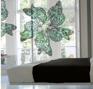
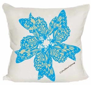
I've always found butterfly wings beautiful. They are so delicate, and yet so visually strong and bold. Unfortunately the actual body of the butterfly...not so much. (yikes!)Luckily, in design, we can just concentrate on the pretty part, hehe- The talented folks at Couturious in London have come up with a goregous piece that showcases them. I posted about their chandelier sheer on AT, but also loved this one. Called "mini beast", these sheers are custom made and come in a few colorways. They also have incredible wallpapers, cushions, and furniture as well- I love this pillow that also has the "mini beast" print on it.

Wednesday, July 05, 2006

too late

Ugh. so so late in posting today. sometimes, when I come home from a long long lame day, I find myself reverting to comfort mode. This includes: bad (but so good) tv, some form of pasta or rice, and ice cream. Tonight, its green tea mochi ice cream... yummy....I also came home to find a lovely package from my dear friend Em. Its the first of a gift subscription from Cloverfield Press. Cloverfield Press is a small publishing house that create beautiful limited edition letterpress books from up and coming writers and artists. I love the simple designs and just the amazing quality that you can only get from hand printed letterpress. (thanks Em!)

So, comfort food and presents in the mail. So nice to come home. Do you have a come-home comfort routine?

Tuesday, July 04, 2006

Independent studies @ Target

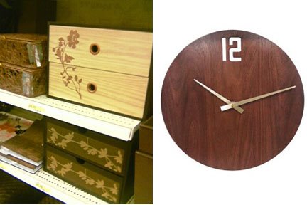
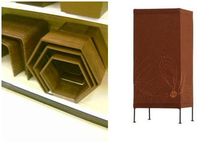
Yesterday, I posted on I(K)W about the new packaging for the fall 06 back to school (college) home collections that are creeping into my local Target(s). Well, today I found out that Target has launched their mini-site for this collection!- and it's called "Independent Studies"- Looks like there are two collections so far, one called "bronze age" and another called "mass transit". The Bronze Age seems to be by art director/designer/illustrator extrodinaire Deanne Cheuk, since she has her signature on two wall art pieces, and it's also possible she designed both collections- but I haven't been able to find any other information about that... anyways, the Bronze Age collection feels right on trend with what I'm seeing other stores are coming out with for Fall, and is also the most sophisticated. I love all the wood pieces, and the florals are done very sparsely. I love this mirror/shelf, and these drawer boxes were great. There's also this beautiful embroidered lamp and canvas wall art. The "mass transit" collection is all red/white/black/grey- and very urban. I love these flask vases in the Mass Transit group- I almost bought one on the spot. Overall the graphics for this season feels a little like Urban Outfitters last year... but it still feels valid, and fresh, and I want it all!!

Monday, July 03, 2006

Blue Monday: Real Simple July 06

The nice thing about holiday weekends is I get a chance to catch-up on magazines. I really am enjoying the visuals in this month's Real Simple. First, I love the cover, with the fork holding up the orchid. It's such a mundane solution, but simple and beautiful all the same. Next, I love the in-between page images, that are all crafted from maps. Maps are always fun to look at, and they have such a great textural pattern quality to them. I always am fond of objects that are made from paper... they did an amazing job with these. Also equally amazing is the main editorial of different uses for household items. I love that they kept a blue theme throughout all the incredible images, by Mark Lund. My favorite is the shot of the blue q-tips! Seeing these mundane items in a fresh light always makes me smile. (especially when they're in blue!) Hope you're having a great holiday weekedn (if you're not working today... like me...boo....)

Sunday, July 02, 2006

numbra

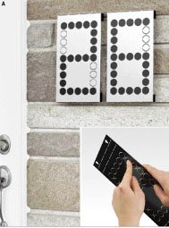
The always good folks at Umbra have released a few fun previews to new items coming soon. My favorite is the "numbra"- which is a customizeable wall-mount house number piece. You just push the adjustable tabs to make any number (or letter?) you want out of the 27 dots. and it comes in black or brushed metal. Umbra just mailed out their latest U+ catalog- which is their more "progressive" funkier design category- can't wait to see what they come up with next! I'll keep you posted....

Saturday, July 01, 2006

mundane aesthetic: shadows